 14 min read


It’s not uncommon for people to spend anywhere from 4-5 hours a day on their cell phones. As a result, it’s more important than ever to make sure your site is mobile-friendly. Taking this into account, Google has come up with something called Mobile-First Indexing. What this basically does is it gives ranking priority to mobile sites so that people on mobile devices have a better user experience. This has of course had a major impact on mobile SEO strategy.
Why is Mobile SEO Important?
Believe it or not, there are still people wondering “why is mobile SEO important.” Ultimately it all comes down to the increased number of people using mobile to perform searches. Some estimates state that 53% of all searches are done on mobile devices. This means that if your site isn’t mobile optimized, you could be missing out on over half the amount of clicks you could be getting.
Search Engine Optimization for Mobile
Optimizing your mobile site to comply with Google’s Mobile-First Indexing is a must if you want to get organic traffic. The good news is that if your site is already mobile optimized, that’s half the battle right there. However, there are many other factors that go into determining your search ranking that you’ll want to look at as well.
One thing to take into account is the fact that despite the statistics concerning how many people are now searching on mobile devices, many businesses have not taken the time to optimize their sites for mobile, or implement a mobile SEO strategy. This means that if you do take the time to make sure your site is optimized, you’ll be far ahead of much of your competition.
Did you know? On average, ranking in position #1 on mobile gets you 27.7% of the clicks, whereas ranking in position #1 on desktop gets you 19.3% of the clicks. (Ahrefs)
With that said, let’s take a look at some of the specific ways that you can optimize your mobile site, and give it the SEO boost it needs to begin drawing in buyer-ready search traffic. As you probably know, getting traffic that’s actively searching for what you have to offer is extremely valuable.
Improve Your Load Times
Does your site load fast or slow? Can you even tell the difference? One thing for sure, Google can, and it will penalize you if your site is considered slow. This is because sites that load slowly will typically have a higher bounce rate, which is when someone lands on your site then clicks off. Since Google wants their users to have the best experience possible, they’ll steer them away from sites like this.
The first thing you need to do is test your site yourself. Load every page and see if there is any noticeable lag. If there is, then you know that there is an issue that needs to be addressed. If all your pages seem to load quickly enough, you then want to have someone else test it. This is because there can be cases in which the site may load fast for you, but not for others.
After that, you want to use Google’s PageSpeed Insights.
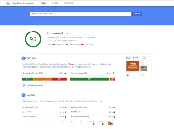
(Image Credit: SEOmofo)
This tool will analyze your website’s load times, and give you a rating based on how it performs. If you get a bad rating, then you’re going to need to figure out what the problem is, and fix it. It could be your hosting provider that’s slowing things down, or something in your website’s code itself. In any case, it needs to be fixed.
Fixing a slow loading website can be done several ways. First you can see if your hosting provider has a better package that guarantees faster loading. If the problem seems to be within your site’s code, you may need to hire professional help to find the exact problem. There are actually page speed experts out there who can help with this and all your page speed problems.
Test your SEO in 60 seconds!
Diib is one of the best SEO tools in the world. Diib uses the power of big data to help you quickly and easily increase your traffic and rankings. We’ll even let you know if you already deserve to rank higher for certain keywords.
- Easy-to-use automated SEO tool
- Keyword and backlink monitoring + ideas
- Speed, security, + Core Vitals tracking
- Intelligently suggests ideas to improve SEO
- Over 500,000k global members
- Built-in benchmarking and competitor analysis
Used by over 500k companies and organizations:
Syncs with 

Using Responsive Design
When you think of the term “mobile device” you might instinctively think of smartphones. However, tablets also count as mobile devices. On top of that, smartphones come in all shapes and sizes, and some even feature unique screen options. What this means is that just because your mobile site looks good on one platform, doesn’t mean it will look good on all of them. Take a look at what a responsive design looks like vs. what it doesn’t:
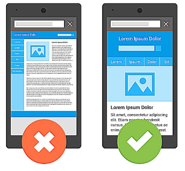
The best way to deal with this problem is to integrate responsive design into your mobile site. Responsive design is when a mobile site is designed to display correctly across all platforms. YouTube is a good example of this. No matter what device you use to access YouTube, it always displays in a way that’s easy to navigate.
You Might Also Like
Integrating responsive design is something that should be done from the moment you create your website. However, if you need to go back and do it, it isn’t always necessary to recreate your site from the ground up. By using a mobile-friendly test, you can determine how your site looks across different platforms, and get an idea of how to make sure that it’s optimized for them.
Local SEO is Still Important
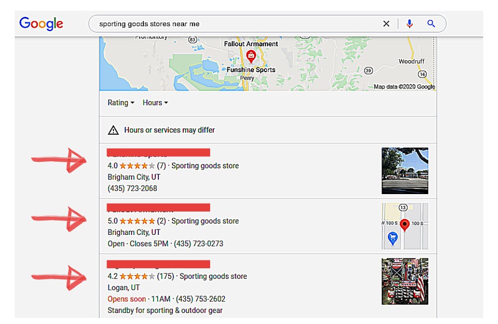
When you’re optimizing your mobile site and implementing SEO, don’t forget that local SEO is still important if you run a business that caters to a very specific location based demographic. For example, if you’re a baker in Denver then you’re going to want to make sure that you’re targeting people in the Denver area with keywords like “baker in Denver.” A Google My Business listing is vital for small, local businesses. Here is what that looks like to someone searching:
The thing about local SEO is that there is a lot more to it these days than just using these kinds of local keywords. There are also a lot of off-page strategies that you’ll need to implement as well if you want to maximize your reach, and cast as wide a net as possible.
For example, listing your business in online directories may seem pointless, but it actually helps to improve your site’s SEO. This is because the backlinks you get from these directories let Google and the other search engines know what area you operate in, and in doing so, help you to rank higher for local search terms.
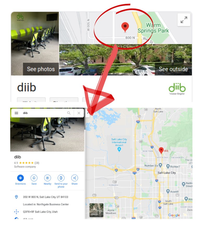
Another local SEO tactic is using Google Maps. Once again this tells Google exactly where your business is located. It can also provide people doing searches with additional info when they find your Google Maps listing, such as your hours of operation. Getting your business listed with Google Maps and linking back to your website is a must if you want to capture local search traffic in your area. For example:
Also, having your business listed in directories and on Google Maps will help when people search for you using keywords that aren’t necessarily location specific. For example, the phrases “near me,” and “open now” have recently become a popular way to find local businesses. When people use phrases like these Google can automatically figure out where they’re located, and present them with search results that make sense. Your directory listings, on-page keywords, and Google Maps listing will let Google know that you’re in their area, and help you get ranked for their search.
Provide Your Visitors with a Positive User Experience
While this may sound somewhat vague since what defines a “positive user experience” can vary from person to person, there are several things that you should take into consideration. Here are some of the factors that pretty much always make up a positive user experience on a mobile device:
- Easy-to-use navigation
- Thumb-friendly design
- Easy-to-read font choices
- Reasonably sized pop-ups
Making sure that your mobile site covers all of these factors is essential when it comes to keeping your visitors on the page, and getting them to do whatever it is you want them to do such as making a purchase, giving you a call, or signing up for a mailing list. Let’s go over each factor individually so that you can see how important they are.
Easy-To-Use Navigation
If your visitors are having a hard time navigating your site, they’re probably going to leave. Google can also tell if your navigation is poorly implemented, and will penalize you in the search results for it. The good news is that creating intuitive navigation for your site is very easy.
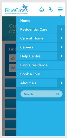
Firstly, have an easy-to-use and clearly visible navigation bar at the top of your screen linking to all the important areas of your site. You can also have drop down navigation to let visitors go directly to specific categories.
Sidebar navigation is important as well. You can have a search bar, archive links, and more that will help visitors find what they’re looking for. Consider having a different sidebar on your home page if you want to feature something specific there like special offers, or an opt-in form.
(Image Credit: Butterfly)
You also want to make sure that you avoid having any dead ends on your site. A dead end is when a page or posts ends without any link to anything else. You should use this opportunity to give your visitors a CTA (call-to-action), or at least have links to related posts and/or products.
We hope that you found this article useful.
If you want to know more interesting about your site health, get personal recommendations and alerts, scan your website by Diib. It only takes 60 seconds.
Thumb-Friendly Design
When it comes to mobile SEO 2023, having a thumb-friendly design is a big deal. Basically what you need to do is make sure that your site is easy to scroll, and that its links are easy to click.
Making your site easy for everyone may seem like a challenge but there are a few simple things you can do. Firstly, you can make your link’s anchor text bigger than the surrounding text so that your readers have a bigger target to click on. You can also keep the clutter and clickable links to a reasonable amount so that visitors can scroll your site without accidentally clicking on anything and navigating away from where they want to be.
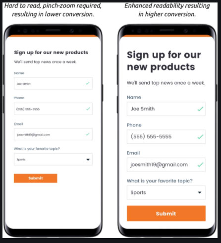
Easy-to-Read Font Choices
If your site’s font is hard to read, people will click off and Google will penalize you for having a high bounce rate. People have absolutely no patience for hard to read fonts, so make sure that you take this seriously.
As a rule, never use a serif font online. Serif font is the flowery looking font used in physical books and magazines. Instead, use sans serif font. Sans serif fonts lack the flourishes that serif fonts have and is much easier on the eyes online, especially on mobile devices with their small screens. Take a look at this example:
(Image credit: Entrepreneur)
Speaking of small screens, you need to take into account the fact that your site’s font will be viewed on a much smaller screen than desktop. This means that fonts that may be easy to read on desktop might not be on a mobile device. Make sure you test your font on different sized devices to see if it’s easy to read on all of them. If not, try making it a little bigger.
Lastly, keep reverse text to a minimum. Reverse text is when you have white text on a black background. While this can be okay in some cases if you want to catch the reader’s attention and draw the eye, it’s a chore to try and read long sections of reverse text. Use reverse text strategically, or not at all.
Reasonably Sized Popups
Everyone hates popup ads, but they can be a powerful marketing tool when used correctly. That said, they can backfire if used carelessly on mobile devices. This is because popups may take up more of the screen than usual when displayed on the smaller screens of mobile devices. As you can probably guess, this will upset the reader even more than usual, and may have them clicking off of your site.
The solution is simple; just make sure that your popups are reasonably sized, and easy to click away when they appear. This will give your readers a better user experience, and increase the amount of time they spend on your pages. As a result, Google will rank your site higher, and it will give you more opportunities to get your readers to take action.
Optimize Your Title Tags, Meta Descriptions, and More
When it comes to search engine optimization for mobile, there are a lot of little things that you can do that really add up in the long run. Things like making sure that your meta descriptions for each page contains the appropriate keywords, and also putting your keywords in your title tags without making them unreadable are always important.
Other things that you can do include giving your images a description, and making sure that they’re sized correctly for mobile. If you’re having trouble figuring out every last little thing that you can do to optimize your mobile site, there are apps that can do a mobile friendly test to help find what you may have missed.
Mobile SEO 2023 Trends
In some ways you can think of mobile SEO being just more of the same in 2021. However, the ways people do searches online are continuing to evolve, and those who don’t jump on these trends will be left behind.
One trend is the fact that people are starting to use social media to search for things instead of just search engines like Google. In fact, YouTube is one of the most highly used search platforms. This means that having a social media presence can help you get highly targeted organic traffic to your site.
Featured snippets are also becoming a big thing. This is when someone types in a search term and Google tries to give them exactly what they’re looking for by placing a snippet from a relevant website right at the top of the first page of the search results. Needless to say, getting a page from your site posted as a featured snippet on Google will lead to a lot of valuable traffic. Here is what a featured snippet will look like on a results page:
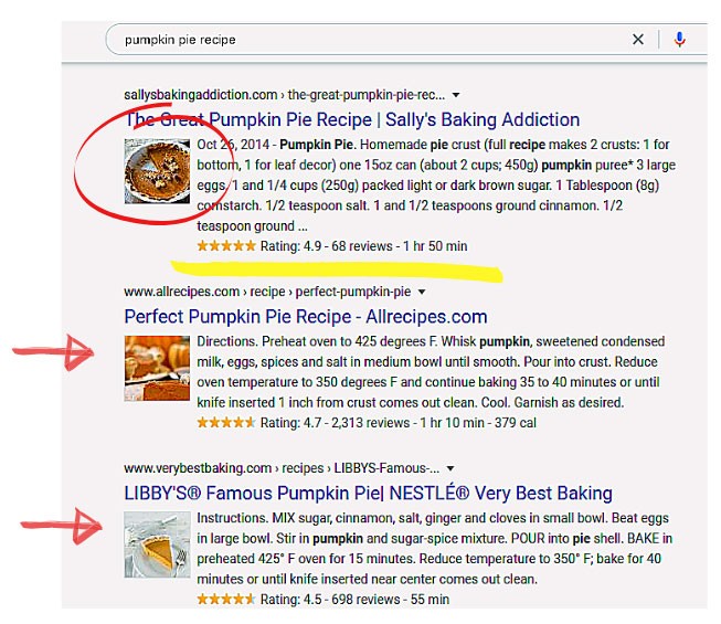
Notice the image and rating accompanying each snippet. It should also be mentioned that since featured snippets take up so much space at the top of the screen, more search results are getting pushed below the fold where they will get less views, and less clicks. This means that getting your pages listed above the fold is more important than ever.
Diib: Your Mobile SEO Experts
To fully optimize your mobile site for Google’s Mobile First Index, you have to be able to put yourself in the shoes of your target audience. If you’re able to do this, you’ll have a better understanding of how to make it easy for them to find what they’re looking for, and you’ll see more traffic as a result.
Getting serious about SEO means putting your visitors first, and being able to cater to their wants and needs. With Diib taking care of the behind the scenes nitty gritty, you’ll be able to focus more on your visitors and their needs. Our customized Diib Dashboard is designed to:
- Provide Custom Alerts, which keep you informed on your website health and any changes to the google algorithms that can affect your mobile traffic patterns.
- Give Objectives with customized suggestions on ways to improve your mobile friendliness, website health and organic traffic.
- Offer our clients insights into not only their own website health, but that of their key competitors.
- Allow you to sync your Facebook profile, giving you insights into the specifics of your social media campaign. Things like specific post performance, demographics of users, best time of day to post and conversions.
Call or text 877-606-2070 to speak to a Sr. SEO Advisor or click here for your free 60 second website scan.
FAQ’s
Since more than half of all global traffic is done on a mobile device, having your website mobile friendly is a must. Google does prioritize mobile page load speed as a key ranking factor.
AMP stands for Accelerated Mobile Pages. This is an update to the algorithm that means that slow loading mobile pages can be held back from higher ranking due to the poor load speed. It can also cause a high bounce rate, as most people aren’t patient enough for the page to fully load.
Here are the steps:
- Open Chrome’s developer tools with the F12 key.
- Click the ‘Toggle device toolbar’ button to turn Device Mode on or off.
- (Optional) Select which mobile device you want to simulate with the ‘Viewport controls’.
- Refresh the webpage with device mode enabled to allow the mobile version to load.
(For iOS 12 and Below) You’ll see a popup at the bottom of the screen. From here, select “Request Desktop Site.” The website will reload, and you’ll now see the desktop version of the site. To go back to the mobile version, tap and hold on the “Refresh” button again and select “Request Mobile Site.”
The best resolution size for almost every smartphone is 640 x 320 pixels. That being said, you should maintain the aspect ratio of the original image or your image may appear distorted.


 See how to easily grow your traffic!
Chris says:
Thank you for How Do I Do SEO for My Mobile Site?
Lauren Rodriguez says:
I have read your blog about the impact of mobile optimization on SEO. It was very interesting and helpful but I can add some extra points in your article. Here some extra points:
1.A Secure and Accessible Website.
2.Page Speed (Including Mobile Page Speed) .
3.Mobile Friendliness.
4.Domain Age, URL, and Authority.
5.Optimized Content.
These are some extra points to add to your article. Readers if you are confused about your web and App development , you can get a free consultation at Alakmalak technologies.Visit our site for more information.