11 min read


User interfaces, or UI for short, are an extremely important part of web design which deals with how visitors are able to navigate the many different pages and interactive materials a website has to offer. UI used to be much more simple in the early days of the internet as HTML was the star of the show, with there being relatively little in terms of artistic choice. However, website development technology and internet user expectations have increased exponentially over the past several decades, making the physical appearance and usability of web interface design absolutely critical.
For those looking to increase traffic and improve SEO, website UI is one of the most important factors involved. Having an aesthetically pleasing, easy to use website is a guaranteed way to get visitors to not only click through different web pages, but also to revisit a website and recommend it to others.
Basics of Good Web UI Design
While looks are important, how easy a website is to use is the primary way to increase popularity and create a dedicated user base. The key is to combine different interface elements to make web page layouts as invariable and logical as possible. Users don’t want to have to guess or strain too much when they’re trying to navigate through pages on a website. It’s necessary to make it obvious where interface elements are on a page, have the description of those elements
instantly understandable, and make element placement as identical as possible on every page. While the last requirement might be difficult to pull off, having a consistent way to traverse a website, like a universal navigation bar, is an essential part of good website design.
Common web UI design elements to pay special attention to are:
- Tooltips
- Tab Bars (specifically for mobile users)
- Steppers/Sliders
- Search Fields
- Sidebars
- Buttons
- Breadcrumbs (link trails)
- Date/Time Pickers
- Icons
- Notifications
- Menus (kebab, hamburger, bento, döner, meatball)
- Comment Sections
- Progress Bars
- Check/Radio Buttons
- Accordions
The right interface element combination can greatly enhance user experience, although it’s best not to make everything overly complicated. For instance, color can be effectively used to direct people’s attention to certain parts of a web page, but if it comes at the cost of making a page hard to read or distracts from other elements, it’s probably not worth it in the end.
UI design should be relatively seamless and provide a sense of trust that website developers are an authority on whatever subject they’re making content for. It should take into account what users are looking for when navigating pages, so that they don’t have to think too much about how a website is structured. Website content should be structured logically, with a sensible hierarchy of information and services.
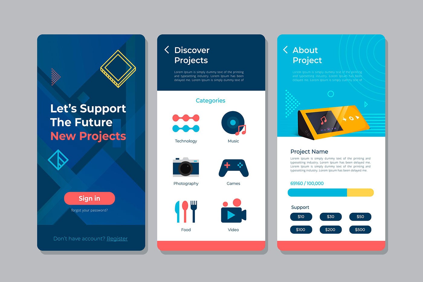
Complex tasks need to be condensed into simple structures which users can access easily. For instance, having a dropdown menu with the most pertinent information listed at the top, with everything else listed in descending order of importance. This would be a great alternative to simply placing a bunch of random links or functions next to each other in either a sidebar or a navigation bar. For example:
(Image Credit: Medium)
UI elements should always be located next to each other in a way that maximizes the interest of users. If a website has a search feature installed, it’s always a good idea to place search buttons next to where users choose or input search terms. Color coding can help immensely in situations like this, but only when it doesn’t interfere with the rest of a page’s layout.
It’s also a good idea to avoid placing too much information on one or just a couple of pages. Even if there’s a lot of good information or tools available on a website overall, if too much of it is compacted into too little space, it’s going to be difficult for users to navigate, resulting in a lackluster experience and a desire to avoid future visits. While users might be unaware of certain website features if everything is more evenly spread out, it will be more than compensated for by making content easier to understand.
Test your site’s SEO and performance in 60 seconds!
Good website design is critical to visitor engagement and conversions, but a slow website or performance errors can make even the best designed website underperform. Diib is one of the best website performance and SEO monitoring tools in the world. Diib uses the power of big data to help you quickly and easily increase your traffic and rankings. As seen in Entrepreneur!
- Easy-to-use automated SEO tool
- Keyword and backlink monitoring + ideas
- Ensures speed, security, + Core Vitals tracking
- Intelligently suggests ideas to improve SEO
- Over 500,000 global members
- Built-in benchmarking and competitor analysis
Used by over 500k companies and organizations:
Syncs with 

Things to Implement in the UI Design of Website
With the basics of web UI design out of the way, it’s good to look at some more advanced considerations which can greatly improve user experience.
- Provide Options for Website Feedback: While it’s possible for some to exactly pinpoint what users are going to enjoy or hate about a website’s layout, the reality for most people is that there are going to be countless issues they’re going to be completely unaware of.
Realistically, the only way website improvements are going to occur is if there’s a consistent stream of feedback from website visitors stating what they liked or didn’t like about their user experience. Most people who visit aren’t going to go out of their way to tell administrators what they thought about the site, so it’s very important to have a feedback submission option that is easy to find and easy to use. Here is an example of a website feedback template that is easy to use:
(Image Credit: Mopinion)
You Might Also Like
- Keep Mobile Devices in Mind: In today’s world, more and more internet searches are being done on people’s phones and tablets. Unfortunately, good web UI design that appears flawless on a PC isn’t necessarily going to look all that good on a mobile device. In some cases, a website might be borderline impossible to use on a phone. Website analytics would be invaluable in this case, as it could reveal whether a large percentage of visitors are using mobile devices as their primary web search option. In the event that this information is unknown, it would be a good idea to err on the side of caution and create a UI layout which keeps phones and similar devices in mind. There are tools that can help you figure out if your website is mobile friendly such as the Mobile-Friendly Test by Google:
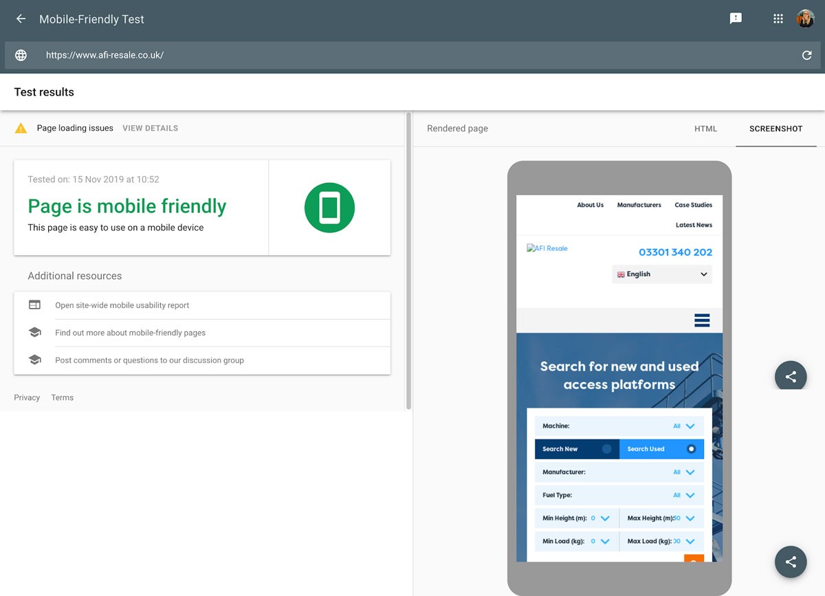
(Image Credit: Google Support)
- Always Place Setting Changes in the Right Place: Although websites can be designed expertly, there are inevitably going to be layout and design choices which are completely in the hands of users. These can include things like biography information, profile pictures, and messaging options. In the event a user wants to change something, options to do so should be obvious and readily available. This usually involves adding a familiar, easy to recognize icon to the corner of a webpage section where the changes will take place, e.g. placing a pencil icon in the top right-hand corner of an “about me” section.
- Use Progress Bars for Forms: Ease of use is absolutely crucial for making a website appealing. In many instances, it may be necessary for users to fill out forms to access services. While designing forms to make them as comprehensive and relevant as possible should be a priority, it’s not really enough to maximize customer experience. For forms which have an excessive amount of information, it’s a good idea to break them up into sections.
People don’t like to be overwhelmed with too many tasks at once, so breaking up submission requests into easy to follow and thematically consistent chunks will convince people to stick with a process much longer than they would otherwise. This sectioning of a submission form should also be accompanied by a progress bar indicating how much farther a user has to go before it’s completed. This will result in not only a mild sense of accomplishment as each section is completed, but also give a clue as to how much farther someone needs to go before a task is completed. For instance:
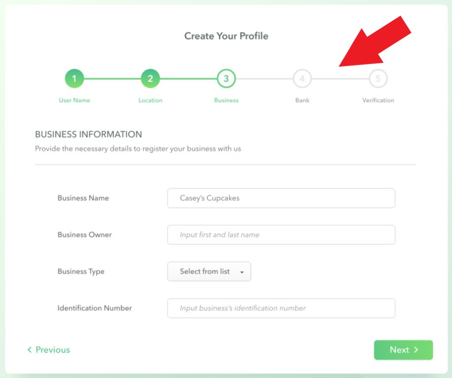
(Image Credit: Dribble)
- Put in Safeguards to Prevent User Errors: Especially if a website deals with a lot of financial information or is very time consuming, it can be uncomfortable or frustrating for users if every little mistake they make can have serious consequences. Understanding what mistakes people might make and finding ways to prevent them from happening or giving options to rectify them is going to improve visitor satisfaction with a site dramatically. These kinds of safeguards can often be seen on ecommerce sites when it asks customers to confirm that they want to make a purchase or if they really want to get rid of the items in their shopping cart. More universally, safeguards are used to remind users that they have not completely filled out all the necessary sections of a form submission.
- Leave Plenty of Empty Space: It’s common for people to think that “more is better” when it comes to website design; however, nothing could be further from the truth. Too much information on a web page can be very overwhelming for visitors. Website UI is best implemented when only the most necessary information is displayed and in a sensible manner. While having too much space can make a web page seem empty, having decently sized spaces can be very useful for highlighting information. People have a tendency to scan through information as opposed to thoroughly analyzing it, so leaving blank spaces in the right sections will give people a much better impression of what information is truly important on a website.
Things to Avoid in the UI Design of Website
While there are numerous ways in which web interface design can be enhanced, there are also a lot of things that should definitely be avoided to prevent a website from becoming a nightmare to use.
- Don’t Make Icons Ambiguous: While it’s certainly going to be a challenge for certain things, always make sure icons are as easy as possible to recognize. It’s not uncommon for websites to change or converge commonly used functions into something borderline unrecognizable and receive lots of questions as to what happened to the UI. At least, that’s the best case scenario; oftentimes many users won’t even bother to look into what happened to a previously used icon or what a new icon is supposed to represent. If an icon change is related to something like social media sharing, the end result could severely harm SEO. If it seems like your icons are too ambiguous try making them a text label, for example:
(Image Credit: Thomas Byttebier)
- Avoid Making Important Actions Overly Vague: Similar to changing easily recognizable icons, important website functions should be really obvious. If the primary purpose of a website is so that users can collaborate on an open forum, make the ability to have people converse with each other as prominent as possible. This can include making thread posting or reply icons exceptionally large or contrasting in color to draw users’ attention to it. If people aren’t sure what they’re supposed to do on a site within a short period of time, they’re likely to abandon its use rather quickly.
- Don’t Make it Necessary to Change Default Settings: People often don’t notice the default settings of programs or devices when they use them as it’s just assumed everything should work fine from the get-go. While some people do enjoy having a lot of flexibility when it comes to settings, most people just want to use a service as quickly and easily as possible. When someone starts using a website, it’s imperative that they aren’t required or feel compelled to mess around with settings options just to start using everything as intended. Even if being given more options seems like a plus from an objective perspective, it’s not going to seem that way from a user’s point of view.
- Avoid Being Too Unique: Creativity is a good thing and is usually the reason why a lot of endeavors become successful, but there are plenty of times it’s highly overrated. Many people use website templates and similar UI structures for a reason: users just prefer it. There are only so many ways in which a singular web page can be configured to look different from everyone else while maintaining functionality. Most websites have vaguely similar layouts and icons as they’ve been proven to be the best at catering to the needs of users.
Resources and Additional Tips
While it may be entirely possible to compile a list of things which greatly improve UI design, actually implementing them on a website can be incredibly challenging. Fortunately, there are a lot of different ways people can figure out what works and what doesn’t. A great first step is to take a look at already established websites with great UI layouts, like Airbnb or Dropbox, and take inspiration from their overall designs. For instance, take a look at Airbnb’s mobile friendly design:
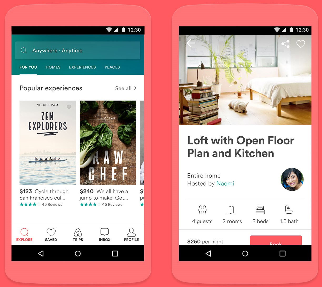
(Image Credit: Google Design)
There are also a large number of companies that provide their clientele with templates which take into account the many different reference points larger websites use to appeal to their user base. Many of these templates are mobile-friendly and are frequently updated to be as appealing and with the times as possible. In addition, these templates can always be supplemented with a designer’s very own creative flair, allowing for a maximum degree of flexibility and inspiration.
We hope that you found this article useful.
If you want to know more interesting about your site health, get personal recommendations and alerts, scan your website by Diib. It only takes 60 seconds.
With inspiration in mind, there are lots of public resources which can be used to figure out a unique format and look. Nowadays, Pinterest is a hotbed of people looking to show off their creative works and there are potentially millions of different patterns and layouts which can be seen completely for free. Additional places that might be worth a look are Dribble and Ui Movement. The image below shows what Ui Movement looks like:
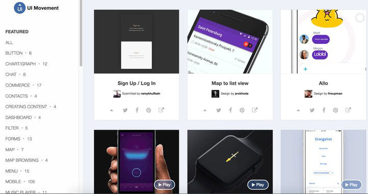
(Image Credit: Product Hunt)
Diib®: Core Metrics to Backup Your UI Design
If developing a website design from scratch is too overwhelming, there are also a large number of programs available which teach how to properly design UI. CareerFoundry and Treehouse are both well-established and come highly recommended. They also come with additional resources to help with website design that extends beyond just UI. As always, Diib offers a User Dashboard specifically programmed to compliment your UI design and keep track of the technical SEO aspects of your website. Here are some of the features we know you’ll appreciate:
- Keyword, backlink, and indexing monitoring and tracking tools
- User experience and mobile speed optimization
- Bounce rate monitoring and repair
- Social media integration and performance
- Broken pages where you have backlinks (404 checker)
- Technical SEO monitoring
Click here for your free scan or simply call 800-303-3510 to speak to one of our growth experts.
FAQ’s
UI stands for User Interface and it’s the process that designers use to build visually attractive interfaces in software or computer devices. They focus primarily on making the interface easy to use and pleasant to look at. It also encompasses voice controlled interfaces and graphical user interfaces.
As discussed in the question above, UI design has more to do with the visual side of the website while web design is less iterative.
On a mobile device, the mobile UI is the graphically and touch sensitive display that allows the user to interact with the different features, apps and content on a mobile phone.
A good user interface is so important in any website as it can turn potential customers into buying customers. It can also facilitate the interaction between the viewer and your web application.
UI is part of the front end development of a website.