 11 min read


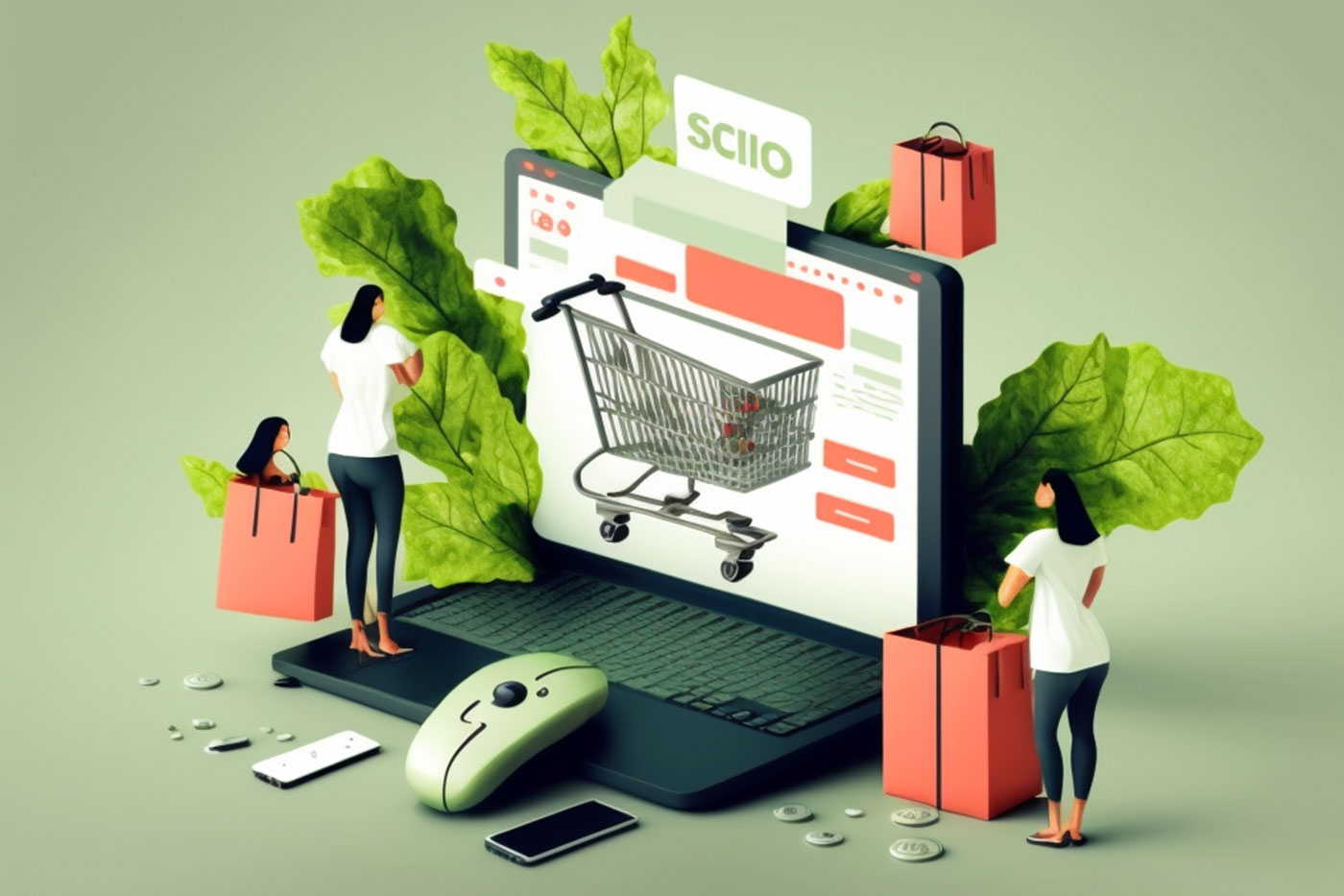

Your eCommerce site is a reflection of your business – its mission, products and services, and values. It’s the place where customers go to see the value of what you have to offer, and, you hope, make a purchase.
Your site needs to sell, but it also needs to be a resource for visitors who have real needs and pain points to be addressed. Those pain points may be the need for an item you’re selling, details on a potential solution or valued information that your site, as an expert authority, can provide.
The website’s importance cannot be underestimated. That’s why its design is so important. You want a site that’s visually appealing, clear and easy to use and attractive, keeping visitors engaged, interested and headed towards a purchase.
To make your eCommerce website stand out, you’ll want to incorporate some proven tips and best practices to ensure you’re delivering the best site for your customers. Here are 9 such tips to make your site stand out.
Tip #1: A Homepage That Tells a Story and Sets the Stage
For most visitors, the homepage will be the first stop on their journey within your website. You will be making a first impression on every visitor. That’s why the homepage needs to have a clean, clear design that is not cluttered, clearly defines your business and helps viewers find what they need.
Here are some of the core components for your homepage:
Branding elements that will create a consistent look on your webpage and in your printed materials. The main branding elements are:
- A logo that consists of an image or graphic and, in some cases, words, that serve as an iconic identifier. You may also opt for logo variations that are used in certain situations, such as in black and white or without words
- A color scheme that is used throughout your marketing materials. The colors should be consistently applied to reinforce your visual identity
- Typefaces that provide a clear sense of your tone and intent. Some faces are more formal than others and using the right typeface helps establish your brand’s persona
- Graphic elements such as shapes, lines, hues and accompanying designs that complement the other elements
- Themes that show visitors what your business is about from the moment they arrive. If you sell food, then you want to be sure you have mouthwatering images of your products. If your sales support a cause, be sure it’s prominent and that the copy shows the impact a visitor’s purchases can make
- Goals that make it obvious what you’re wanting visitors to do. If your goal is to drive sales, make sure that links to your products pages, for example, are prominent and not just a top-navigation link
- Contacts andsocial media links that make it easy to connect with you directly and find you on other platforms
Tip #2: Convenience Is Key in Design, Search and Navigation
UX (user experience) needs to be front of mind when designing your site. Does it create the right cues, prompts and navigation that leads your visitors to what you’re wanting them to do? The last thing you want is a site where it’s confusing for visitors to find what they need.
The navigation often will lead visitors to the section of your eCommerce site where they can buy products or services. But in some cases, you want visitors to complete other tasks, such as leaving contact details, joining a mailing list or downloading an app.
No matter what the desired outcomes, you’ll want to follow some proven design attributes that help ease the visitor journey, including:
- Consistent use of the brand logo on each page with a clickthrough to your homepage. The logo should be within site at all times, no matter how deeply a visitor navigates
- Breadcrumbs that allow people to navigate the page hierarchy and return to familiar positions when moving through the site
- A catalog that helps visitors switch between product types and find what they’re looking for
- A search bar that lets visitors find what they’re looking for quickly. Be sure that the search bar is prominent, easy to find, and included on all pages
- Filtering functions that allow users to find a specific item or category of items on product pages
Tip #3: Branded Images Make a Difference
Bold, compelling photos can really make a difference on your site. You want images that are professionally done, cropped properly and part of the story you’re telling. Shoddy photography can turn off viewers.
When thinking about the photography for your eCommerce site, be sure to use branded photos. Branded images have a similar look and feel, evoking a tone that is relatable and in sync with your site’s overall vibe. You want visitors looking at the images to feel as though they are all from “the same family.” That means having consistent colors (that are a part of your branded color palette) for backgrounds, and if using text, being consistent about how it is incorporated into your photographs.
The photos should be of a similar size on each page and be of a similar style. If you’re using portraits (of models, customers, employees) be sure they are all cropped to the same depth, filling the same amount of frame. If you feature products on each page, be sure that they are zoomed in to the same display depth and positioned similarly.
Take Tailor Brands, their website photography incorporates illustration elements and uses soft-color backgrounds. White-lined frames and other arrowed lines pull visitors to key points in the photo. Most importantly, they make sure our images help inform and explain the story being told in our blog posts, products and services pages and other sections of the site. The overall effect is to have a cohesive, story-focused set of images that are familiar from page to page.
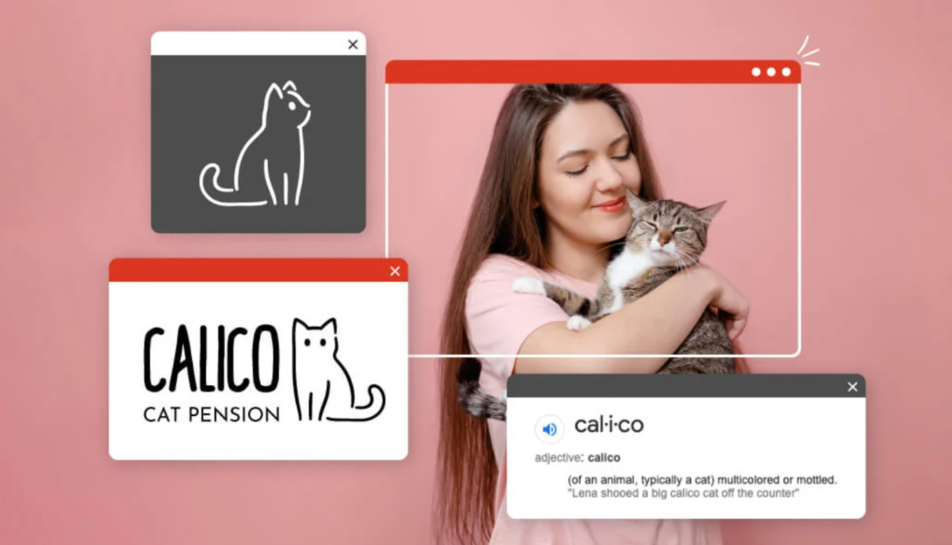
Source: Tailor Brands
You Might Also Like
Tip #4: Mobile-Friendly Design Matters
Today, your visitors are more likely to connect to your site via a smartphone than a desktop or laptop computer. That means your site needs to be built with a mobile-first mindset. If your site is not designed to be easy to navigate on mobile, you’ll lose customers.
Most commercial website design tools take this reality into effect but be sure that you’re designing a site that has mobile top of mind. And when you’re testing your website, be sure to look at it on multiple devices, mobile and otherwise. That means iPhones, Android phones, Windows PCs and Macs. There may be some elements that don’t work on a certain device or operating system and any such glitches should be fixed before going live.
Tip #5: Keep It Simple
Your audience will be coming from many different backgrounds, experiences and sophistication levels. There will be visitors who are very familiar with the products you offer and others who need to be educated about what you provide.
Your eCommerce website should be easy to move around and to absorb. There should be a purpose for every element on your website – to sell, to educate or to connect. If it’s not needed, don’t add it.
You want your website to “breathe” with enough white space to ensure viewers don’t feel the site is overcrowded. Don’t oversaturate the site with multiple colors and tones, and keep the copy brief and simple to read.
Tip #6: Scannable Content Helps Busy Visitors
“Strain” is not a word you want associated with your website. Visitors should not strain to see the content on your page or find what they need.
Keep your site scannable with pages that viewers can skim through quickly. This can be a hard pill to swallow. You may want long, detailed product descriptions that give every possible use and feature. You may consider having lengthy pages devoted to each staff member’s life story. You may want to cram as many products as possible on your page.
However, those text-rich, hard-to-follow pages are more likely to drive visitors to another site. Scannable pages are key. Most viewers are not going to read content word for word. Instead, they’ll quickly look for key words that cause them to pause and consider a product.
Keep all the content on your pages – from the homepage to product descriptions to About Us sections – easy to read with bite-sized paragraphs, bullet points and strategic use of emphasizers such as bold or italicized text.
Tip #7: Social Proof Adds Credibility
Do you have an active social media presence, reviews or feedback forms? Such information can be invaluable to your marketing work. Adding transparent customer reviews, testimonials and other product feedback adds social validity from real users.
This social proof helps viewers see that other customers have been helped with, enjoyed or gained value from the use of what you offer. It’s a powerful way to convey the worth of your site.
Tip #8: An Opportunity to Collect Information
You want to be present in the hearts and minds of past and potential customers alike. But communicating to those groups means having good contact information. You want to take the opportunity to sign up visitors to your website for mailing lists, newsletters and other ways to share information and drive people back to your site. Having a page and a pop-up form on your site to request information, download a white paper or join a mailing list is a key way to build your customer base.
Tip #9: A Simple Checkout Process Does Wonders
When you’ve gotten your customers to the point of making a purchase, you want it to be a seamless, simple process. A wonky checkout page can do as much harm as other unappealing pages. Even though you have a visitor just about to close as sale, a complicated checkout can cause a buyer to abandon the transaction.
Be sure that the checkout page is simple and that what information you need is clear and well-defined. If there are shipping options, different mailing and billing addresses, the need to capture an email and/or phone number and key elements required for the transaction, be sure the site is clear and helpful. Make it easy for people to pay you!
An eCommerce website makes all the difference when it comes to your company’s success. Having the right strategies and best practices at your disposal can make your website stand out.


Joe says:
Great guide and I completely agree with all of these points – the only thing I would add is that to improve the checkout process and reduce the chance of cart abandonment, it’s a good idea to allow guest checkout. Some people won’t want to create an account just to make a one-off purchase, but if you want to encourage account creation you can always offer a quick sign-up option after the purchase has been completed.
Alexpaul says:
I like this article, it is very informative. thanks for sharing