Top Ecommerce Website Designs by Industry
EMarketer estimates that eCommerce will be $5 trillion by 2021.
You can take advantage of the tremendous growth and claim a part of the pie. However, you need a website that attracts buyers and keeps them scrolling and shopping.
Regardless of the advanced features that your website has, people still judge books by their covers. You have to make your website appealing from the homepage to the product pages.
Most successful eCommerce websites have a less cluttered homepage and landing page. The best eCommerce design has appealing visuals, interesting text layout with different font sizes, and a clear call to action.
- What comprises the industry leading website designs?
- How do you pick the best ecommerce layout design?
For starters, the website pages have to be user friendly so that the users can find what they need fast. Whether accessed through PC or mobile, a user needs to locate the items they need without asking for help.
Besides friendliness, the website needs to offer awesome visuals. These may be photos, videos, illustrations, infographics, or color blocks. The visuals should be in all the pages from the landing page to the product and checkout pages.
Away from the home page or the landing pages, shoppers need more directions with their shopping. One of the tricks that successful ecommerce sites use to include user-generated content on their sites in the form of user reviews. This is a great way for the users to trust the products offered and the business.
Related products are also common on sites such as Amazon, eBay, and other top sites. These related items help you navigate the ecommerce site with much ease so that you can find what you need without hassle.
Other features that matter include:
- Wish Lists
- Special Offers
- Contact Us Touchpoints
- High Security
- Social Proof
- Multiple Payment Options
When customers come to your website, they are there looking for convenience. They need to find quality products with ease, proceed to checkout, and have their products shipped within a few days. Your ecommerce website, regardless of the industry, should offer the convenience that the buyer doesn’t get from a brick-and-mortar store.
The best ecommerce website design, therefore, considers the needs of a customer from the time they land on the pages to when they receive their product and beyond.
Special offers, security, payment options, and any other features you choose to include should enhance the user experience. When a customer navigates from the landing page to checkout without any challenges, then you have already achieved the best web design.
Test your site’s SEO and performance in 60 seconds!
Good website design is critical to visitor engagement and conversions, but a slow website or performance errors can make even the best designed website underperform. Diib is one of the best website performance and SEO monitoring tools in the world. Diib uses the power of big data to help you quickly and easily increase your traffic and rankings. As seen in Entrepreneur!
- Easy-to-use automated SEO tool
- Keyword and backlink monitoring + ideas
- Ensures speed, security, + Core Vitals tracking
- Intelligently suggests ideas to improve SEO
- Over 500,000 global members
- Built-in benchmarking and competitor analysis
Used by over 500k companies and organizations:
Syncs with 
Multi-Industry Ecommerce Sites
These sites offer products from almost all industries from dinner spoons to car parts, and they have been successful at it:
Amazon
There are so many successful ecommerce websites out there, but Amazon tops them all. When Amazon started, it offered a text-heavy layout and not the intuitive and appealing design it has today.
Today, the success of Amazon relies on data. The site collects data on all its customers, including how much a user spends on a page, which other pages they visit, the categories users visit more, and so much more. For example, Amazon has recommendations based on what you have already viewed:
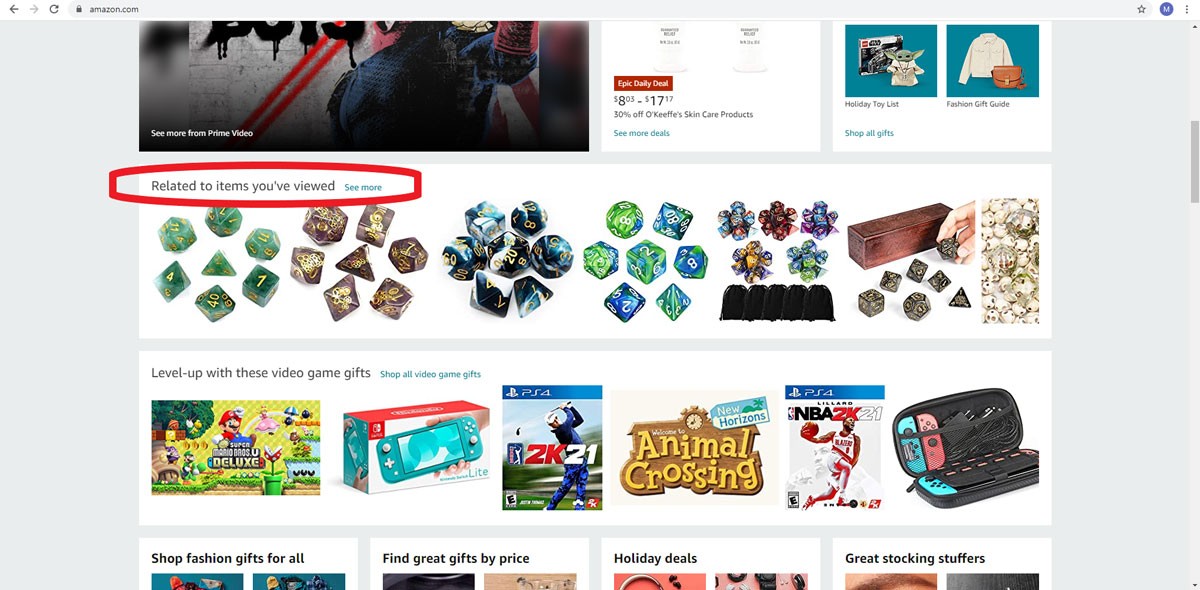
You Might Also Like
(Image Credit: Amazon)
From the collected data, Amazon can adapt its presentation to the needs of the customers. By collecting as much data as they can on their customers, the ecommerce giant is able to deliver exactly what the customers need. All design tweaks on Amazon are to meet the needs of the customers.
You can collect data for your website too. Customers appreciate simple intuitive designs. If, for instance, you remember a customer’s name and their favorite categories, you are on the way to create a design that is on the way to becoming the next Amazon.
Walmart
Walmart recently refreshed its design. The ecommerce giant now offers what most other successful ecommerce sites offer, large images with compelling text. Like Amazon, Walmart also leverages on data to bring customers location-specific offers and product categories that adjust based on your needs.
Walmart is in a rush to keep up with all changes that Amazon has adopted, including same-day delivery and a host of other intuitive features.
One of the features that Walmart has adopted is free next-day delivery. This is a way for the ecommerce giant to compete with the services that Amazon Prime members enjoy. There are also ancillary and local-friendly services such as grocery pickup to make the customers enjoy more convenience.
Target.Com
The desktop homepage for Target.com brings an offer to customers while communicating a sense of urgency. When you get to the website, the first thing you see is that there is a sale that allows you to save up to 30 percent of the product price. There is also a promo code that helps you save up to 15 percent, and you can also enjoy free shipping.
This sense of urgency attracts shoppers to check out your products and the offers you have. The mobile version of the website comes with tappable tiles that make it easy for customers to navigate with ease.
There is always a deal on Target.com, and that is what they show on the landing page. Whether it is Halloween, Memorial Day, or Christmas, or any other day, there is a sale. For instance:
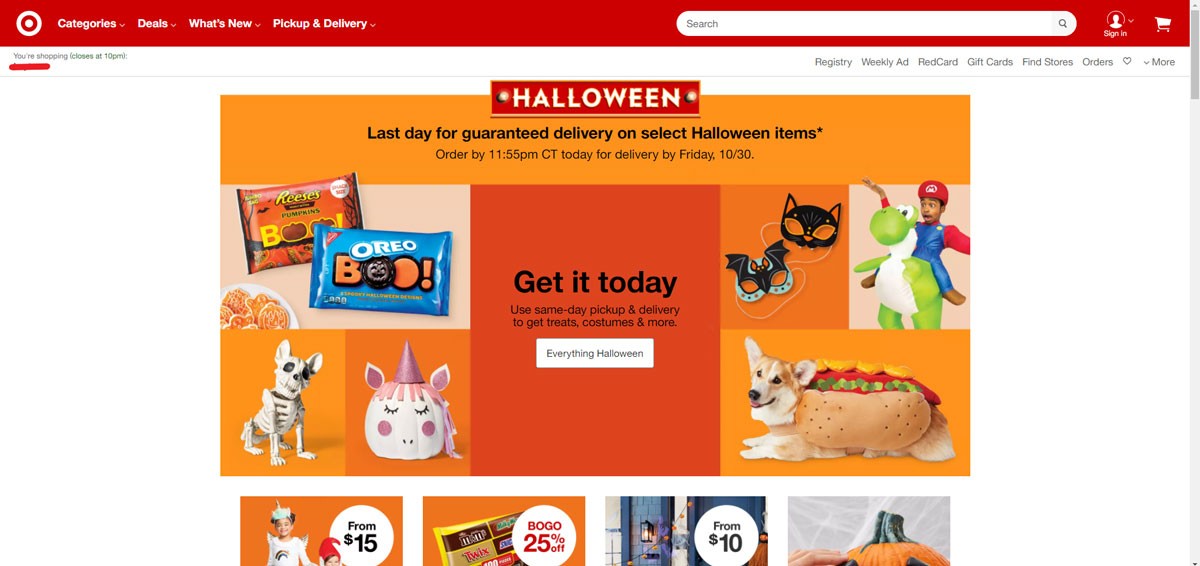
(Image Credit: Target)
Do you have discounts and offers for your customers? Perhaps you should try having a few of those on the landing page.
E Commerce Pages Web Design for Various Industries
Nike
Industry – Apparel
Nike uses bold images to communicate the message to its customers. The athletics products giant supports physical fitness and delivers products that exude confidence and style. For example:
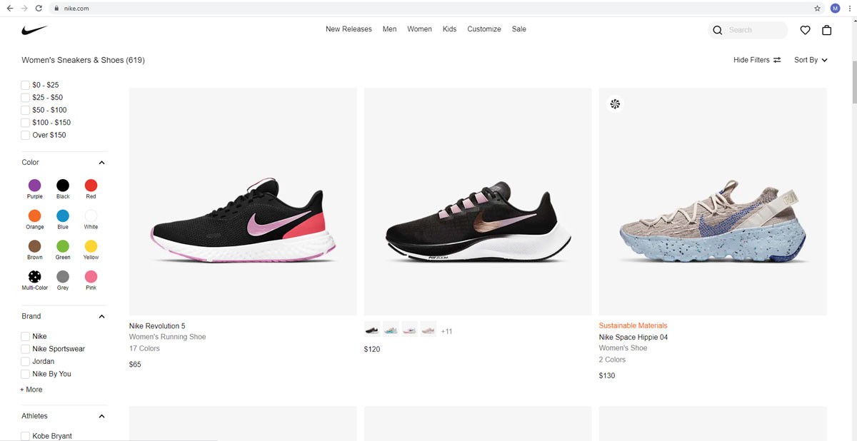
(Image Credit: Nike)
When you open Nike, the bold images will attract you to check out the products. On the landing page, you can also see any offers that the brand has and a link to download the Nike+ App. Through the app, Nike continues to engage its customers.
Most of the images on Nike are of customers in action with some of their products. Besides, Nike’s fitness app offers the brand a chance to engage the customers more and give offers specific to mobile users. Although Nike still offers responsive design, they now concentrate more on mobile-first design.
According to Statista, mobile devices account for more than 50 percent of internet traffic since 2017. It is this realization that makes Nike target customers on mobile devices more. You can do so too with your ecommerce website.
Dali Decals
Industry: Home Improvement
Dali Decals has mobile friendly icons on its pages to attract customers on mobile devices. These are icons similar to what is seen on mobile devices, and they make navigation easier. For instance:
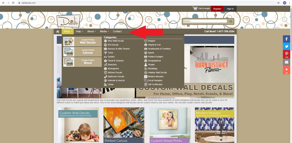
(Image Credit: Dali Decals)
Like Nike, the site is targeting the increasing mobile traffic. With brands expecting more than 50 percent of their shoppers to be on mobile, creating a mobile-friendly site comes in handy.
You can follow Dali Decals idea to make your website friendlier to shoppers on mobile. You do not have to use the same icons as long as the design you choose attracts mobile shoppers.
Standout
Industry – Apparel
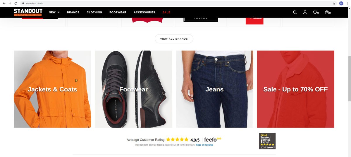
Standout offers bold images for each of the categories they have. The site, which offers men’s designer clothing collection, offers bold images with a link to the category on their website. This makes it easy for shoppers to discover the products. There are no unnecessary distractions as the customers only need to pick the product they need.
To create a beautiful ecommerce web design as on Standout, you need to keep the homepage less cluttered. Instead, only offer bold images and helpful links for customers to find what they need. Your images and links should be compatible with both desktop and mobile devices. For instance:
(Image Credit: Standout)
Home Depot
Industry – Home Improvement
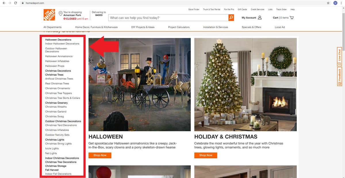
Home Depot has some of the best category page designs. If you click on any categories on the site, you will see a sub-category menu on the left side of the screen. This menu shows you everything the site has on the category you have selected. For example:
(Image Credit: Home Depot)
Besides the sub-category menu, Home Depot shows you any offers available for that category in a large banner. As you scroll down, you will see different fonts and font sizes to meet your needs. This way, the site can achieve its search engine optimization goals without cluttering the pages.
The site only uses a few images on its pages to increase the load speeds of the pages. You can achieve what Home Depot has by creating pages with a few visual design elements and a responsive design. Whether your customers access the mobile or the desktop website, they should see all the elements of your pages and the pages should load fast.
We hope that you found this article useful.
If you want to know more interesting about your site health, get personal recommendations and alerts, scan your website by Diib. It only takes 60 seconds.
Milani
Industry – Beauty
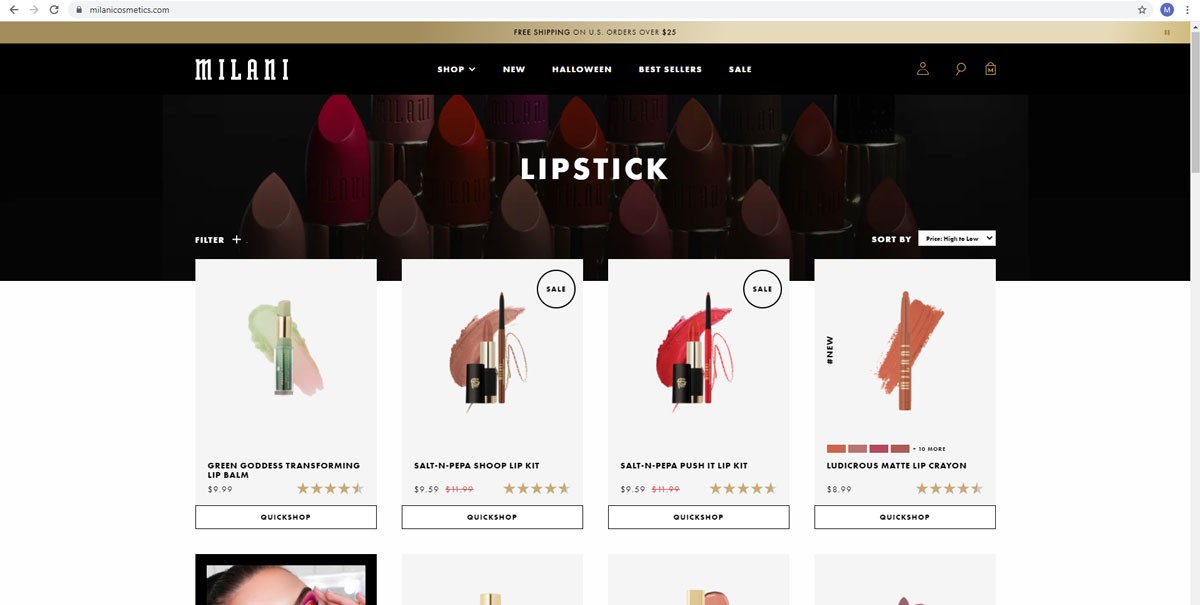
Milani uses comparative imagery to bring out the distinction between different products they offer. The ecommerce site carefully selects images to bring out the unique characteristics of each product they offer. Each of the images is visually appealing. This way, it takes customers less time to compare and shop available products. Take a look at their appealing images below:
(Image Credit: Milani)
If you have products from multiple brands, you can apply the same design on your ecommerce to make it easier for customers to shop.
Nordstrom
Industry – Fashion and Beauty
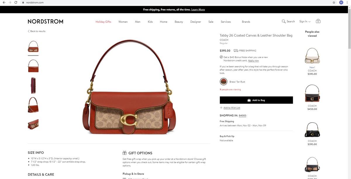
Nordstrom is here for its powerful product pages. When looking at products on Nordstrom, you can see the workmanship that goes into creating every piece. If you are shopping for a bag, you can see the stitching and any other product details. For instance:
(Image Credit: Nordstrom)
The high-resolution lifestyle images engage their customers more. The products are also available from multiple angles. The shop uses sophisticated language to describe the products to match the target market. The description paints a vivid image in the minds of shoppers.
High-resolution images are great for product pages if you need to attract customers and make them hold on to checkout. Nordstrom also offers black and white images optimized for mobile devices. You can select a color option and the site instantly changes the color of the products.
The same design is seen in Nike’s high quality images with a minimalistic product page.
CAR iD
Industry – Automobile
CAR iD sells customizable car parts. The challenge with selling such parts is that customers want to be sure they are getting the right parts for their car’s make, model, and year.
The product pages on CAR iD allow users to select the make and model of the car after which the site assures you that the product will fit. You can see 3D modeling of the parts in your car model. Here is the landing page asking you what your make, model and year of your car is:
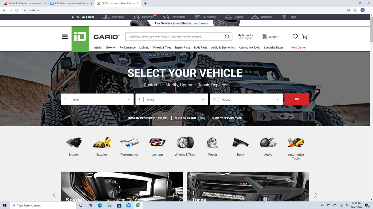
(Image Credit: CAR iD)
Some companies offering customizable parts allow you to drag and scroll the images to see the products from different angles. This way, you are assured that the parts will fit perfectly. Better yet, the use of Virtual Reality has enabled car parts sellers to enable buyers to visualize how different products will look and feel like before buying.
Airbnb
Industry – Transport
Airbnb has one of the simplest checkout pages. To achieve the best ecommerce design, the site offers a checkout process that is intuitive and well-thought-out. There are no distractions along the process, and this makes it easy for you to shop.
Airbnb further uses its brand color on the call-to-action button. This kind of the clutter-free checkout page is great when you need to make the purchase process simple for customers. The most beautiful ecommerce web design is not complete until customers can check out without adverts and other distractions. The image below shows the colorful call-to-action button:
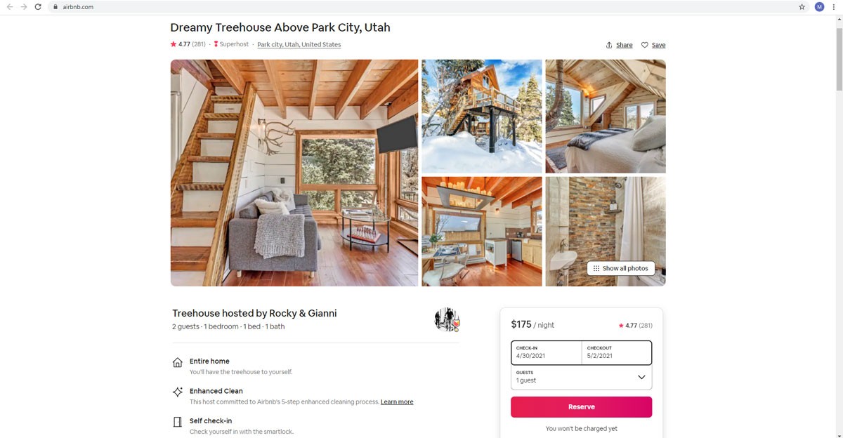
(Image Credit: Airbnb)
It is time you removed clutter from your checkout page.
WeBuyBlack
Industry – Multiple Industries
WeBuyBlack sells different products from different industries. The site uses bold images with minimal descriptions. The beautiful ecommerce website design allows users to see more of the products without the clutter that comes with a lot of words.
WeBuyBlack may have the best ecommerce layout design for About Us pages. There are no lengthy stories of the founders, just a few lines on what the brand does. Everything else is a blank page and a vivid illustration on one side of the page. This is what the About Us page looks like:
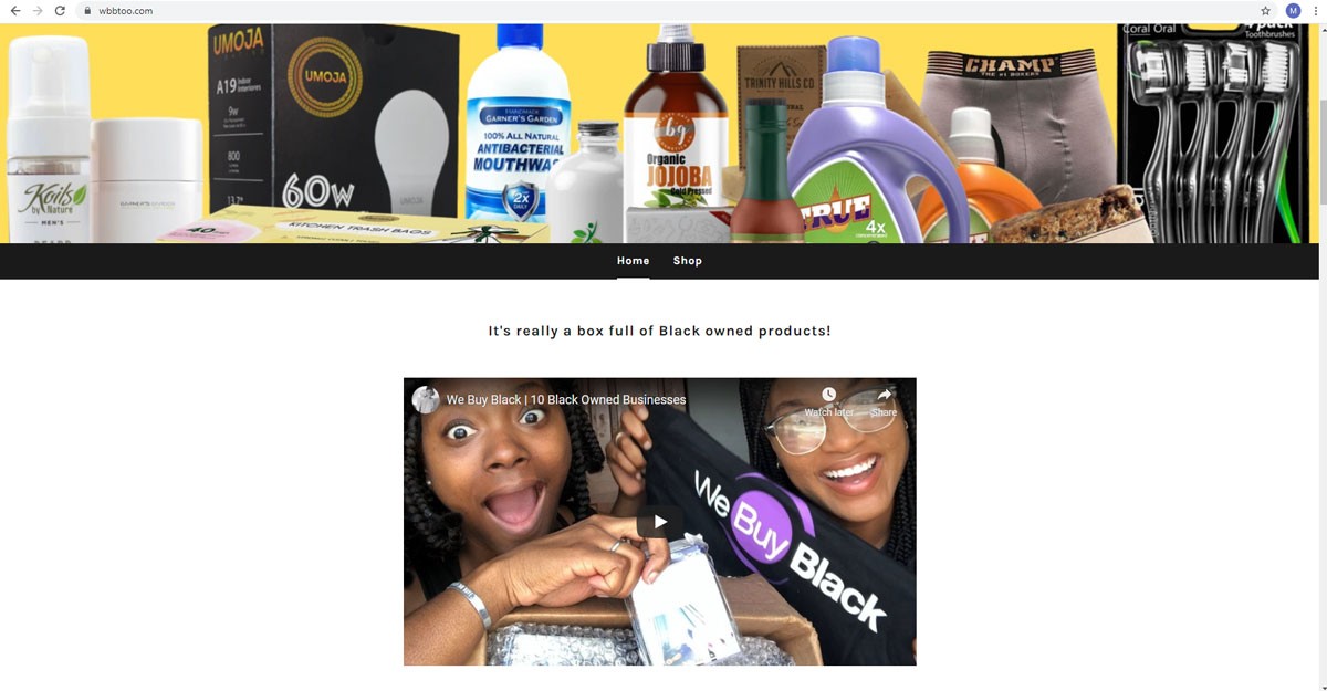
(Image Credit: WeBuyBlack)
Flowers Online 24
Industry – Home Improvement
Flowers Online 24 has a map that allows you to discover their business online and offline with much ease – there is a map on the homepage. This might be the best e commerce pages web design for businesses with a brick-and-mortar store and needs to be discovered with ease.
FlowersOnline24.com has added its store address and hours of operation. You can then find the perfect place to place the map on any of your pages. For the best ecommerce page design, you can place the map on your about us page or at the bottom of the home page.
If you do not have an offline store, this feature may not work for your online business.
Implementing the Best Ecommerce Page Design
Do you want to create industry leading website designs? Below are tips to help you do that.
The Landing Page and Homepage
Avoid cluttering the page by removing parts of the pages that are not helpful. Instead provide useful links to help customers find what they are looking for with ease.
Ensure your site is accessible and easy to use on mobile and desktop.
Give customers access to all the categories on your website so that they can shop with much ease. While at it, you can use high-resolution images with concise details on the products in any given category.
On these two pages, you can direct customers to your offers and discounts and sales. You do not need a lot of details on the offers as long as you can show a few details. You can also use unique images to show the authenticity of the products. Do not use stock images.
Product Pages
Images are more important in your product pages than in any other pages. Customers need to see the best images of your products and detailed descriptions. Here, you need to have SEO friendly content that users will find easy to scan.
Precise descriptions allow the customers to make the buying decision with ease.
Details such as color and size are very important for most products. You need, therefore, to be very clear on these details. Shoes and apparel need a sizing chart to ensure that the customer buys the best product. The best ecommerce website design might even have a series of questions that help customers choose the best sizes, colors, and designs or products.
You need to offer a way for customers to filter products based on various factors such as size, color, price, reviews, and much more based on their preferences. Even though you need to provide sufficient details, you also need to leave plenty of white space by layering content on your product pages.
Diib®: Track the Success of Your Website Design!
When designing your website, put yourself in the shoes of your customers: What would you like to see or experience in your favorite store? Whichever design you choose, your focus should be on user experience. Ask yourself how you can give the users exactly what they need and start working from there. Diib Digital User Dashboard can provide up-to-date metrics on the effectiveness of your website design and overall traffic. Here are some of the features we’re sure you’ll love:
- Customized Objectives designed to enhance website performance
- Alerts that tell you about your Domain Authority other technical SEO issues
- Broken pages where you have backlinks (404 checker)
- Keyword, backlink, and indexing monitoring and tracking tools
- User experience and mobile speed optimization
- Bounce rate monitoring
- Social media integration and post performance
Click here for your free scan or simply call 800-303-3510 to speak to one of our growth experts.
FAQ’s
6 of the best Ecommerce website builders we’ve come across are as follows: 1) Wix: is the best for beginners. 2) Shopify: Ideal for customization. 3) Squarespace: best for social media integration. 4) BigCommerce: good for scalability. 5) Weebly: best for building any type of website. 6) 3DCart: good for those with some site-building experience.
Good web design for an ecommerce site is about using the right colors, fonts, images, words and graphics that will convince visitors to purchase. It needs to be attractive and portray your shop in the best light.
Amazon is the largest online retailer in the United States.
Building your own ecommerce website is a bit more different than your average website build. You’ll also need to worry about processing payments and other tools for business management.
GoDaddy does have a free website plan you’ll never be charged to use. They do have an upgrade available to premium features. You won’t lose the work you’ve done to your free site if you upgrade.
