 14 min read


How to Create a Mobile Website
According to Statcounter GlobalStats, as of February 2023, 52.08% of the total web visits are currently mobile, compared to 47.92% coming from desktops. This means that making your site mobile-friendly is as important as ever. Why risk turning away half of your potential sales?
You can learn how to make a mobile website without sacrificing the experience of your desktop users or the speed and functionality of your website. The process is most likely much easier than you think. Only four basic steps are necessary to create a successful mobile website.
Mobile Websites: It’s All In Your Approach
You have several different options for the creation of a mobile-friendly site. Every type of web design has different advantages depending on the specific requirements of your website. You need to consider each type before deciding which one will suit your needs the best. Your first option is called responsive website design, or RWD for short.
Responsive Web Design
Responsive web design uses adaptable layers. This is accomplished by using a combination of backend grids, extensions and proportion-based media. When your browser window is contracted or expanded, your content will follow and adapt appropriately. This enables your website to have a similar appearance for both mobile and desktop users.
Take a look at the image below. It shows the difference in size for the different devices but the template stays the same:
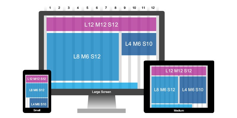
(Image Credit: SAP User Experience)
A comparison is often made between this type of user interface and liquid. When you pour a liquid into a jug, glass, pot or container, the volume doesn’t change just because you are using a different type of vessel. This means your website will remain essentially the same for mobile and desktop users.
Adaptive Web Design
AWD or adaptive web design is different from RWD because it isn’t reliant on a single changing layout. Distinct layouts are used with adaptive web design according to the size of the screen and the device. When a user visits your website, they will receive the page appropriate for the device they are using. You can create multiple websites for smartphones, desktops and tablets.
All of your designs are placed on standby until your website receives a visitor. As opposed to one website for everyone which is not suitable for all users, adaptive web design allows you to create a type of customized gateway.
Once you have decided which approach is best for your website, you have successfully completed the first step to make your own mobile site.
Here is an image that shows the difference between Responsive and Adaptive visually:
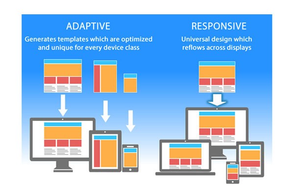
(Image Credit: Neil Patel)
Create Mobile Version of Website with a CMS or Website Builder
Now that you’ve decided how your website will function on mobile devices, you are ready to create your website. The platform you choose is essential for your mobile design plans. If you are a basic user, you have two options, a content management system or CMS or a website builder. You can create a mobile website with either one.
Website Builders
Using a website builder will eliminate any guesswork from your mobile design. You can create a customizable website rich in features in minutes. This is accomplished by selecting your template or theme, then using the drag-and-drop feature. You can see how different themes look and remove anything you do not like quickly and easily.
You Might Also Like
Most website builders allow you to determine your site’s reaction to mobile. Some builders rely on an adaptive approach, while others focus on responsive web design. The website builder you choose must use the same approach you decided on in the first step or the needs of your website will not be accommodated properly.
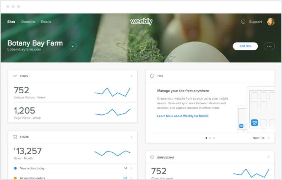
Weebly allows you to build your website desktop and mobile friendly:
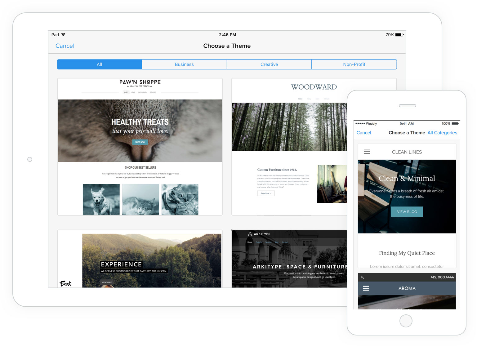
(Image Credit: Weebly)
Content Management Systems
If you are interested in a dedicated website builder, your best option is a content management system (CMS). A CMS is more reliant on the internet and computer knowledge. The benefit is you will receive more features than offered by a website builder. A CMS also offers designs appropriate for both AWD and RWD. A CMS is capable of integrating both mobile design approaches into the many available themes. When you consider how to make a mobile website, your theme is critical.
Downloading a mobile-ready template is easy. Many are available for free or you can pay a fee to find the right theme for creating your website. You will find a lot of themes that include regular updates and full support. This eliminates the need to manage and maintain your website.
Test your site’s SEO and performance in 60 seconds!
Good website design is critical to visitor engagement and conversions, but a slow website or performance errors can make even the best designed website underperform. Diib is one of the best website performance and SEO monitoring tools in the world. Diib uses the power of big data to help you quickly and easily increase your traffic and rankings. As seen in Entrepreneur!
- Easy-to-use automated SEO tool
- Keyword and backlink monitoring + ideas
- Ensures speed, security, + Core Vitals tracking
- Intelligently suggests ideas to improve SEO
- Over 500,000 global members
- Built-in benchmarking and competitor analysis
Used by over 500k companies and organizations:
Syncs with 

Designing Your Mobile Website
Once you have decided which platform you intend to use, you can start the process of designing and creating your site. The principles for designing your website are the same regardless of whether you want to create an eCommerce store, business website, portfolio or blog.
After you have finished your design, you need to conduct testing to make certain your RWD site is responding correctly or create another design for an AWD site. The design process is simple but you must consider the following factors. .
The Power of Mobile Devices
Laptop and desktop computers can handle heavy loads due to the processors and graphics cards. Despite the power of mobile devices, they are built differently. Since the form is considered more important, the function is lost. This means mobile devices may be unable to handle the heavy content acceptable for computer processors. If these types of resources are necessary for your desktop users, you need to consider another site offering the same kind of performance for your mobile users.
Fast and Relevant Information
Especially on mobile, users visit websites for important information regarding the locations they intend to visit, including phone numbers and store hours. If your users do not find this information quickly, chances are good you will lose a customer. You need to include fast links to relevant data and contact information for your mobile website.
Organizing Content
You need to be certain everything can be accessed by your mobile users when creating your website. Mobile users require the same information but are working with a smaller screen. There are two important concepts you need to consider, mobile-first and mobile second. Mobile-first is a more recent concept in the world of design stating your mobile site needs to be designed before creating pages for tablets and desktops. This is because you can use this content for desktop versions as well.
This approach results in a responsive and dynamic website with the same content available for both mobile and desktop users. If you have already created a desktop website, you can organize your content with mobile-second. This is a lot more difficult but not impossible. You need to determine which elements of your desktop website are necessary for a mobile version.
You can use standard analytics tools to gather data including:
- The information generally ignored by your mobile users
- Content your mobile users consider the most important
- Which path is generally taken by your users
These insights can be used to determine which content should and should not be available on your mobile website. Once you have cleaned up your desktop website, you will be able to layout the design for your mobile viewers. You can then begin developing your mobile website.
Design for Touch
A mobile device will not allow your users to hover with their fingers or right-click. This means your mobile website must include space links to make certain your users do not click on an incorrect link accidentally. You can accomplish this by:
- Buttons can be used to define where your users can click
- You can receive feedback when a user touches their screen
- Text input can be minimized
- Your drop-down menus should be redesigned
Navigation
When you are considering how to create a website on mobile, do not forget mobile phones have small screens. You need to minimize the navigation options for your mobile users. Once this is complete, use a few of the most popular mobile devices to test your site. You might be surprised to know approximately 90 percent of your users have the same devices. For example, look at Home Depot’s mobile website and how they make it easy to navigate:
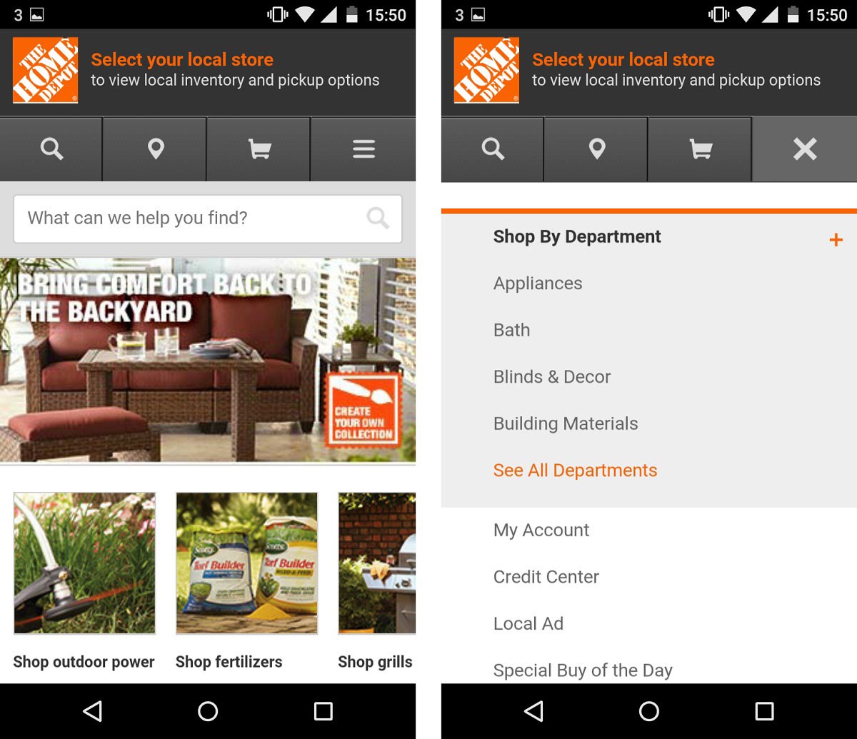
(Image Credit: DeviceAtlas)
The information above will help you to create or redesign your website to ensure convenience for your customers. Now you need to know how to manage your website using a mobile device. This is beneficial for eCommerce sellers keeping track of their stats, photographers interested in uploading photos of their surroundings and for any type of website.
How To Manage Your Own Mobile Site
There are numerous options available for the management of your mobile website from a mobile device such as WordPress. Once you have selected the app you prefer, you need to complete your Android or iOS download to begin managing your mobile website.
After your installation is complete, sign in to your new app or account just like you would from your desktop. You can now manage your mobile website regardless of your current location. Although most apps have similar functions, the WordPress app is being used as an example.
Viewing Stats
After the publication of a blog post, you most likely want to know how many people have viewed your blog. You can use the statistics tool to check the traffic to your blog even when you are not home by using your mobile device. Simply open your app, choose your website and click on the link for stats to begin. You will be automatically directed to a new screen showing your overall user statistics. Days is your default view. You can switch to Years, Months or Weeks to see different periods of time.
For instance:
(Image Credit: Weebly)
Insights
Tap on the button marked Insights to see a more detailed overview of the inner workings of your website including:
- Visitor comments
- Analysis of the most popular times for visits
- Statistics
By checking these screens on a regular basis, you will be aware of how well your content is performing. You can remain informed to understand which type of content is the most popular with your viewers according to your traffic volume and the most popular time of the day. You can determine if your users check your website in the morning before work or view your most recent posts right before bedtime.
Mobile management tools allow you to customize your website. This means your mobile website can meet the demands of your users through the publication of content during the time your site is viewed most frequently.
For example:
(Image Credit: Pinterest)
Checking Notifications
Checking your notifications gives you the ability to respond to your comments from any location simply by using your tablet or phone as opposed to waiting until you can access your desktop computer. You can take advantage of the option to receive a notification every time a comment is left by one of your visitors. Since you remain current with conversations and comments in real-time, a positive rapport can be built with your followers and fans of the future.
Tapping on the Notifications icon will display all of the comments received by your mobile website including pingbacks and trackbacks. Your content can be filtered just by visiting this section of your app. You will see five options on the Notification screen, All, Unread, Follows, Likes and Comments. One category can be isolated simply by tapping on your desired option.
We hope that you found this article useful.
If you want to know more interesting about your site health, get personal recommendations and alerts, scan your website by Diib. It only takes 60 seconds.
Push Notifications
You can use your tablet or phone to receive push notifications regarding your mobile website. The moment one of your followers leaves a comment, you are alerted. If you enable the Likes feature, you also receive alerts if one of your posts is liked.
You do not need to take any extra steps to receive this feature because push notifications are automatic through your app. You can immediately leave a reply to your comments through the notification feature. Your readers will know both their concerns and questions are your top priority.
Writing New Content for Publication
In the past, it was not possible to use a smartphone to write or publish new content such as a blog. Due to improvements in technology and the demands of modern society, uploading content using a mobile device is essential to ensure your mobile website remains relevant and timely. A good example is if your business is celebrating an important anniversary. You can publish your photos in real-time using your mobile device as opposed to waiting until after the event is over and you return home.
This will ensure you can share special occasions to keep your visitors engaged. You can tap on Blog Posts to navigate to your website through your app and add a new post. All of your existing posts or content will be displayed. You can write new content for your mobile site, access your drafts and see the posts you have already published. Simply tap on the plus sign to create a new text for your website or a new post.
You can use your mobile device to publish or create new content or to make changes in your content by using the Edit feature. You can even see the way your content appears to your viewers to determine if any changes are necessary.
Uploading and Importing Images
Images can be uploaded to your mobile website directly through your mobile device. The cameras on smartphones have improved significantly and consistently as time has passed. You can attract more users to your website by posting pictures of events, incredible meals, beautiful landscapes or anything pertaining to your business. You can accomplish this faster and easier with a mobile device than your desktop computer. As your business continues to grow, you can attract more customers.
Diib: Core Website Insights at Your Fingertips!
Creating a mobile website is not a difficult process. Managing your website is even simpler. The bottom line is if you do not have a website suitable for your mobile users you will lose customers. If your website is not clear, there are large blocks of text or the loading time is too slow, your users will go to one of your competitors.
Diib provides core insights and statistics to help you create a successful mobile website. Here are some of the user features you’re sure to love:
- Statistical insights into not only their own mobile website health, but that of their key competitors.
- Custom Alerts to keep you informed on your website health and subtle google algorithm changes that can affect your traffic.
- Objectives give you suggested ways to improve your mobile website health and overall traffic.
- We sync with Facebook to give you insights into specific post performance, user demographics and conversions.
Call or text 877-606-2070to speak to a Sr. SEO Advisor or click here for your free 60 second website scan.
FAQ’s
Wix.com is free for as long as you would like, however, if you want/need the professional version with advanced features, you’ll need to sign up for a premium plan.
First of all, scrolling a mobile website vertically rather than horizontally is what users are most comfortable with. Try to avoid larger elements that don’t allow for adjustment. Make your content adaptable and use CSS media queries for different styles.
On average, it costs anywhere from $200-$500 to self build your own website, with roughly $50/month maintenance. If you want a professionally designed website, that cost escalates to around $6000 with maintenance costs of around $1000/year.
This is a design strategy that helps adapt your website to the smallest screen first and working your way up to larger screens. It is generally about delivering the right user experience to the right device.
The real answer is that this is up to you. It comes down to what you value, your SEO requirements and CMS. If you choose a basic and minimal approach, Wix is likely fine.


 See how to easily grow your traffic!
website design company in hyderbad says:
Hi,
Very nice Article. Thank you for sharing useful information. IFBA India is a Web development Agency which provides Web Solutions like Website Design, Graphic Design, Website Redesign & Mobile Application Development. IFBA technology & creativity to build interactive, innovative & efficient portal solutions for its client. IFBA offer portal development solutions packages according to categorized needs of clients.
monthly seo packages india says:
Excellent! Tha nks for creatin g this amazing content. I really liked the way you described all the points related to Marketing in detail. It’s very helpful.
Search Engine Optimization Company Kolkata says:
Thanks for writing an article that I found easy to read and understand. I just found this site and am looking forward to reading more of your posts!
sarthak says:
very informative
sarthak says:
very informative content
slope says:
I appreciate your post because it has a lot of good information that I can absorb and learn.
digitaltreed says:
As the mobile web landscape continues to evolve, articles like this one serve as essential resources for businesses and website owners looking to create an optimal mobile experience for their users. Thank you for sharing this informative and well-structured guide on creating a mobile website. It’s a valuable asset for anyone seeking to stay competitive in the mobile-first digital era.
MetaMask Extension says:
Securely manage your digital assets with the official Metamask wallet extension. Easily access and store your cryptocurrencies with this secure and user-friendly tool. Download now!