11 min read


A visualization is a powerful tool that allows us to make sense of the world around us. It is not just a matter of visually looking things up but also involves processing all the information we encounter in our daily lives. We only use a fraction of our brains for visual processing. At the same time, the rest of our faculties are primarily concerned with the processing of verbal and non-verbal information. In this article, we will discuss why medical infographic examples are a necessary tool.
How do we process visual information?
Visualization is the process of mentally taking all the data you have absorbed and transforming it into a more easily-understood form. This mental process is responsible for producing brain maps. Visual information is beneficial since people only remember 20% of what they read, but 80% of what they see. This confirms that appealing to traditional visual processing methods (i.e., hand/eye coordination and the ability to “feel” a situation) enhances comprehension when dealing with graphs, charts, or other visual presentations.
The second way in which we process visual information is through the so-called mental imagery. We visualize various situations and objects in our minds, and then we translate these mental pictures into physical manifestations. This process is beneficial when trying to deal with the complex world of the visual cortex.
Eight common types of free medical infographic templates:
- Informational infographics.
- Timeline infographics.
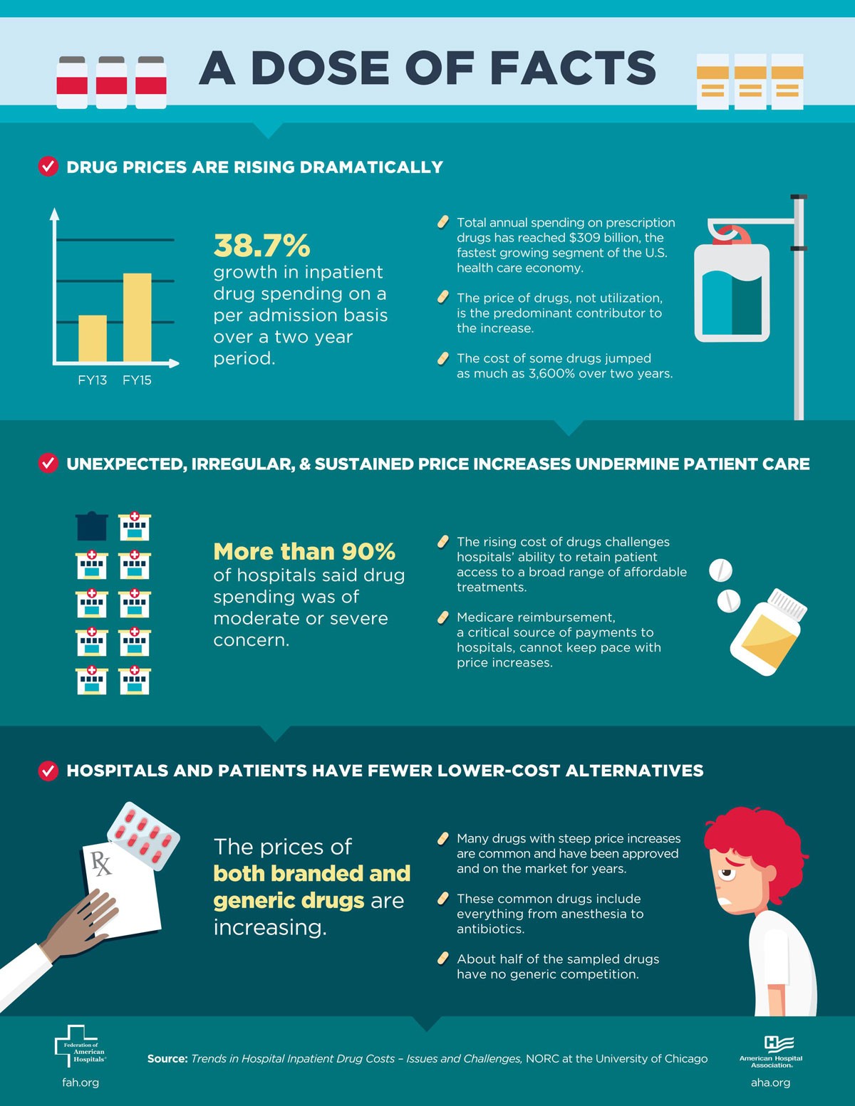
- Statistical infographics. (Image Below)
- Geographic infographics.
- Process infographics.
- List infographics.
- Comparison infographics.
- Hierarchical infographics.
(Image Credit: Visme)
Visualizations are valuable because they force us to ask and answer specific questions. For example, according to the Laws of Physics, when we are driving, we must keep our eyes on the road. To do this, we must see moving objects. Here’s where imagery comes into play, helping your brain make sense of the world around you.
The brain is mainly used for visual processing, as previously mentioned. Therefore, poor visual function can affect not only our short term memory (the information that stays in our short term memory) but also (and perhaps most importantly) our long term memory.
Understanding why visualizing your data helps to consider how all the visual information passes through the brain. The cortex processes information first. Once it reaches the cerebrum, it passes on to the rest of the nervous system. Once it receives the information, the visual system processes it twice. This information process gives us our memories.
Did you know??? Images are returned for 22.6% of search queries on Google. In fact, 62% of Gen Z and Millennial consumers want visual search more than any other new technology. (ImpactPlus)
Using Color in Infographics
With the help of free medical infographic templates, we make our most important messages easy to understand and remember. By using color in infographics, we can make information easier to remember. When used correctly, colors can increase attention spans by 82% and memory by 86%. More than half of the population prefers to see color-based messages to black and white ones.
No matter who made the presentation or who listened to it, most people only remember about 10% of what they read three days later. In contrast, when information is in visual form, people retain approximately 65% of it three days later.
Improve your content marketing + SEO in 60 seconds!
Diib uses the power of big data to help you quickly and easily increase your traffic and rankings. We’ll even let you know if you already deserve to rank higher for certain keywords.
- Easy-to-use automated SEO tool
- Get new content ideas and review existing content
- Checks for content localization
- SEO optimized content
- Built-in benchmarking and competitor analysis
- Over 500,000k global members
Used by over 500k companies and organizations:
Syncs with 

Useful Health Information For Infographics
According to the Center for Disease Control (CDC) and the World Health Organization (WHO), useful health data is: “the important health data set that accurately informs and guides public health efforts.” Likewise, the World Health Organization defines it as: “a compilation of facts about diseases, health issues, demographics, and prevention, developed by the WHO and other global health organizations.”
Top Health Information sources for healthcare infographic data:
- World Health Organization data sources
- Google Open Data Explorer
- Center for Disease Control and Prevention CDC
- American Hospital Association AHA (Image Below)
- HealthData.gov datasets
Data sets like these from the CDC and WHO provide comprehensive but up-to-date statistical analysis about the populations’ health to prevent disease and protect people from illness. While the United States has developed health information collections by coordinating state and federal public health programs, other countries have not.
You Might Also Like
The use of useful health information goes beyond preventing disease. By monitoring trends and the health and demographics of the world’s populations, epidemiologists learn how to prevent a disease and manage it. In particular, useful health information helps demographers make accurate projections of the populations’ future health needs worldwide.
Demographers use population data to investigate death’s causes and predict the number and rate of deaths due to various conditions. They also use the data to create health statistics graphs that show projected trends in the number of deaths over time.
Access to and utilization of public health information and knowledge about the nation’s health as a whole is crucial because public health professionals depend on such statistics to determine how to address current health problems and evaluate new outbreaks of disease.
Because the use of public health data requires large amounts of data to compile and analyze, many public health programs rely on large data sets that span the globe. For example, the United States Department of Health and Human Services, or the Department of Health and Human Services, owns and operates the world’s largest health records database. However, because it does not have centralized control over data sources, the agency relies on states and other entities to compile and distribute the necessary information. This often results in the purchase of data sets from private companies that specialize in distributing health-related information and knowledge.
Factors affecting the accuracy of such data include data compilation and analysis. Public health measures provide an excellent example of the difficulties involved in data collection and analysis.
Because of the wide variety of data sources and the challenges people have faced in collecting and interpreting health information over the years, there have been many rumors about public health information’s safety and reliability. These rumors have led to criticism of anecdotes in public health measures and have even led some health organizations to ban anecdotal information in their reports and analyses.
Another drawback to relying on anecdotes for any part of public health is that they may not reflect what actually happens in real life. Thus, health officials risk overestimating public health initiatives in rural areas and underestimate the impact of initiatives on real people.
As a solution to this problem, a good healthcare infographic allows the easy correlation between factual data and visual cues so that the impact of interventions can be more easily assessed and understood. The graphics usually cite authoritative sources. For instance:
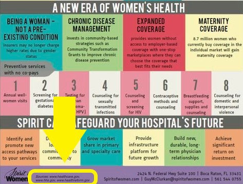
(Image Credit: The Healthcare Marketer)
Infographic examples healthcare professionals use to distribute health information make data accessible to people who would otherwise not understand its implications. For instance, the widespread use of hospital discharge sheets helps explain the reasons for the emergence of certain diseases and demystifies them.
Another advantage of good health information is that it can provide the basis for effective public health interventions. It also makes it easier for researchers to conduct and evaluate health interventions and to design future strategies. Listed below are seven tips to help professionals produce a medical infographic design:
- Make sure your content is visually appealing.
- Make sure you’re concise.
- Make sure you’re creative.
- Make sure you are accurate.
- Make sure you provide value and interest for your readers.
- Don’t violate copyright laws.
- Cite your sources (always be transparent)
Good health information provides easy-to-understand graphical representations of the relationship between health indicators and health outcomes. These patterns of causation are not always perfect but are sufficient to show how and why various interventions correlated. It also shows where the correlation is weak and highlights where improvement is necessary.
How Infographics Help Overcome Language Barriers
Some people don’t speak or read English. Because of the diverse language and cultural reasons. As medical facilities are becoming more localized, communicating with patients can be difficult. Sometimes, basic information is not understood, and it may take a long time to address a patient’s needs fully.
Cultural, linguistic, and language barriers in the Medical Field:
- It is challenging to find reliable and professional interpreters in health professions.
- A patient’s language or ethnicity may vary significantly from that of their care provider.
- A health care provider not using an interpreter appropriately
- Patients may not have access to printed information in their native tongue.
Communication is crucial to ensuring a high-quality healthcare system. Researchers found that translation tools like MediBabble and Google Translate improved healthcare delivery and patient safety in hospitals. There was at least a 92% improvement in physician and patient satisfaction in the study.
Healthcare providers have a more difficult time communicating with their patients because of language barriers. As a consequence, patients have lower levels of satisfaction. The likelihood of patients experiencing adverse events and healthcare expenditures is greater for patients who have language barriers.
When healthcare providers and patients speak the same language, it makes it easier for care providers to:
- Obtain necessary information for a diagnosis
- Participate in joint decision-making
- Explain what therapeutic approaches can help
One solution to these problems is to use informational infographics to communicate information quickly and virtually to all types of patients. Infographics are visual presentations and stories that draw on relevant data and then relate that information to an audience. Healthcare professionals, doctors, nurses, and patients use infographics to overcome language barriers, informing patients of their treatment options, explaining medical procedures, or conveying information on diseases and conditions. For example, this one that uses words as well as pictures:
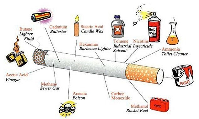
(Image Credit: Daily Mail)
Infographics are effective communication tools in rural hospitals. Because most people do not read or write English, doctors need a way to communicate with them. Many health centers have a limited number of technical staff members, making communication difficult and confusing. Language-limited patients experienced:
- Physical harm detected as a result of severe adverse health events (49%)
- Temporary moderate harm (46.8%).
- A lack of communication with medical providers (52.4%)
As a result, 66.7% of patients reported difficulty accessing healthcare, while 20 % expressed the concern that they could not understand their healthcare providers. These stats illustrate the importance of patient access to view charts and graphs detailing their health history and easily compare their condition to their peers.
We hope that you found this article useful.
If you want to know more interesting about your site health, get personal recommendations and alerts, scan your website by Diib. It only takes 60 seconds.
How Medical Infographic Examples Convey Messages
The visual graphs, charts, and images can help patients, doctors, and other staff members understand their patients’ condition and treatments. Healthcare professionals can post infographics on walls to give patients a visual image of what they need to do to treat their illness. In rural or underserved areas, this visual aid can help patients find the doctors who know best and are willing to go the extra mile for them.
The power of an ideograph lies in its ability to tell a story. An ideograph is a story in and of itself. Someone can base these stories on research studies, real-life experiences, or even created by using a combination of these elements.
Infographics can communicate important information about the disease, treatment, symptoms, and prevention. Doctors can tell patients about their condition or what they need to do to prevent certain diseases. A primary care communicative tool like an ideograph allows a primary care physician to tell a story that helps the patient learn and understand more about their illness.
Nurses and medical personnel can use infographics to convey critical information or help patients. In emergency rooms, graphic representations of severe injuries, diseases, or symptoms help suffering patients.
Using an ideograph as a primary care communication tool can help emergency rooms where English isn’t the dominant language. A primary care communication tool, such as an ideograph, helps patients regain accountability in several ways. It tracks the number of times they went to the emergency room, the number of tests they’ve taken, and their prescriptions.
Infographic Designs
This article is the first in an ongoing series about different types of infographics. This article aims to show how they can convey a range of health information, from simple descriptions of symptoms to more complex information about medical procedures and treatments.
Five types of infographic designs
- Isotype Array – This type of infographic illustrates the relationship between negative and positive outcomes on a part-to-whole basis. You can use it for communicating dichotomous information.
- Polar Area Diagram – These charts come in three types: Coxcomb charts, Rose charts, and Polar Area Charts. Instead of extending outward from the circle’s center as in a regular pie chart, a Polar Area Chart has each sector extending at an equal angle. The polar area diagram illustrates cyclic activities such as the death rate by month. For example:
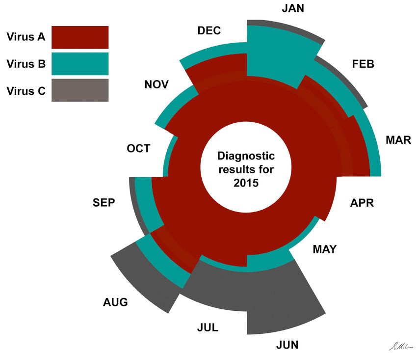
(Image Credit: ResearchGate)
- Word Cloud – The word cloud is simply a graphic that distills large amounts of information into a few key phrases. It is usually possible to combine them into one image for easier analysis. The final type of infographic I want to introduce you to is the word spotter infographic, respectively.
- Hub and Spoke Diagrams – They’re called hub and spoke diagrams because the design looks like spokes of a wheel. Companies use Hub and Spoke diagrams to visualize details within a significant concept or finding.
- Charticle – these infographics combine text, graphics, and images. They are the most commonly used replacements for articles. A charticle has an inverse text-to-image ratio compared to a regular article, so it is essentially a graphic. For instance:
Infographics are one of the most effective tools to have at your disposal as a doctor or nurse. Consequently, it is vital to use them very carefully. Infographic examples healthcare patients read are powerful marketing tools that allow you to draw patients in with compelling descriptions and then get them to trust and believe in the information you are providing.
Things to Avoid
Some infographics span over two pages. EPRS infographics cover a topic in a few pages. Most of these publications include graphics as well as information. Graphic elements are normally placed on the first page of an infographic to illustrate the presented data/information.
Avoid these three mistakes when making a medical infographic design:
- If you make an infographic on a subject that many have already covered a lot, you need to offer the audience something new or exciting. If you can’t emphasize with further information, then avoid that subject altogether.
- It is important to be as specific and simple as possible in your text.
- Make sure your infographic is accurate.
Memory is one of the most precious commodities that we possess. If it becomes physically dysfunctional due to the visual system’s poor function, then low retention of that information becomes a physical problem. It’s not surprising, then, that the portion of the brain responsible for memory is relatively highly involved in visualizing data. This is all the more reason for infographics’ rise in popularity in modern professions. If your brain cannot visualize what you are trying to remember, you will not retain the necessary information.
Diib®: Healthcare Infographic Stats Quick!
There are many benefits to using infographics in the medical field. You can share data from these sources quickly and easily. They are a cost-effective and a highly effective way to communicate critical data. Most importantly, they are a direct and personal communication tool. An infographic connects the medical community with the community it serves.
Partnering with Diib Digital gives you vital metrics that tell you how your infographics are received and what more you may need to do. Here are some of the key features of our User Dashboard that set us apart from the crowd:
- Keyword, backlink, and indexing monitoring and tracking tools
- Google Core Algorithm monitoring
- Platform specific monitoring and user demographics
- Alerts to broken pages where you have backlinks (404 checker)
- Alerts and Objective that guide you to strengthen your website
- Monthly call with a growth expert
Click here for your free 60 second site analysis and industry ranking or call 800-303-3510 to speak with one of our Growth Experts.
FAQ’s
An infographic’s effectiveness depends on several factors. The ones that work best are simple to comprehend, well-designed, and tell a captivating story.
Information overload leads to the worst kind of infographic. Too much information on graphs and charts defeats the purpose.
There are so many tips we could share on crafting appealing healthcare infographics. Here are a few of the most important:
- Be concise.
- Be visually appealing.
- Be of value and interest to your readers.
- Be accurate.
- Be creative.
- Be transparent and always cite your data sources
- Be mindful of copyright
As we’ve talked about in this blog, people retain more visually than they do through reading. These infographics can bridge a gap in both knowledge and language. They will help people to change behaviors that could cause them harm.
This doesn’t have to be complicated. Here are the steps:
- Step 1: Go to the SmartArt Graphic Box.
- Step 2: Select Your Preferred SmartArt Graphic.
- Step 3: Edit Infographic Text.
- Step 1: Visit the Page and Sign Up (Free)
- Step 2: Start with the Infographic Creation Process.
- Step 3: Begin with a Template (Or Create a New Blank File)
- Step 4: Add Infographic Data.