 11 min read


Google offers many different services for tracking performance and collecting metrics for your website visitors. One of these services is called Google Analytics. You can check numerous visitor metrics including conversion rate, average session duration, bounce rate and page views. You have the ability to efficiently track all the data you need regarding the performance of your website with Google Analytics with one exception. You are unable to generate heat maps to visualize the data you have collected.
In the past, this exception was a concern because that meant you needed to make an investment in visualization tools. In some cases, this was fairly a large expense. An SERP analysis was conducted on Google for heat map Google Analytics. The results showed there are two completely different intentions behind this query. The first is some consumers are interested in using data from Google Analytics combined with the Page Analytics Chrome extension for learning the right way to create a click map for their website.
The second intention is the analysis of data using a variety of different heat maps. No matter what your intention, it is important to understand how to read a heat map. Google has addressed the gap between data visualization and numerical data by releasing a feature for in-page analytics. You can use this feature with the Page Analytics Chrome extension. This will help you with both qualitative and quantitative data.
What is a Google Analytics Heat Map
The most popular tool currently available for tracking your website data is Google Analytics. You can use this tool for measuring and monitoring the performance of your website so you can make any necessary improvements. The heat map now available from Google Analytics offers you a much easier way to interpret all of your website data. Since heat maps are visual, you can see the page generating the most user interactions. For example:
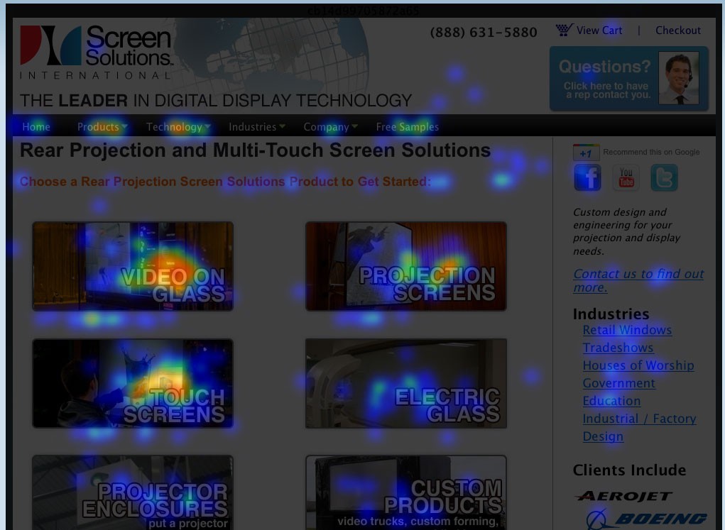
(Image Credit: Drupal)
You can also find out the areas of your site your users are spending the majority of their time clicking. You can use Google Analytics heat mapping to place the information you need directly on the areas of your website your users are focusing on. Heat maps are essentially a visual representation of your metric’s individual values. Once you are able to view a visual representation of the data from your website, you can determine how your visitors are interacting with your site. `
You can also see which links are being clicked and the most interesting sections of your site. If you want to improve your conversion rate by establishing an engaged audience, you need to understand the behavior of your visitors. You can then use everything you learn to your advantage. Your heat map is a graphical representation for all of your data. Colors are used to depict different values. Heat maps make understanding and visualizing complicated data simple, fast and easy.
The process used for what is now referred to as heat maps is believed to have started during the 19th century. This was when data patterns were first depicted for tables and matrices using a manual gray-scale. Although heat maps from Google Analytics are very efficient, you can still create your own heat maps if you choose by using specialist software or an Excel spreadsheet. The idea is to visualize the hot or most popular and cold or most unpopular elements of your pages using a color scale.
The color scale is from red to blue so you can determine the hot and cold spots. Heat maps enable you to aggregate the behavior of your visitors for data analysis. Only a quick glance is necessary to determine the interactions of your visitors with your individual pages. You can see what is clicked on, ignored and scrolled through. This helps you optimize your future engagements and identify current trends. The simplest definition of a website heat map is using a map or diagram to represent graphical data.
Reading a heat map is a simple process because you can easily see different data sets and values because they are displayed using different colors. Due to the constantly increasing popularity of the internet, heat maps have become essential for anyone with a website.
Heat Map History
The history of heat maps began as 2D data displays you could view in a data matrix. Darker colors were used as a representation of larger values such as gray and black. Lighter pixels were used to represent smaller values and faded to white. The concept of using light to dark shading for a matrix for displaying values can be traced back to the 1870s. During the 1950s, scientists discovered how similar results could be displayed using a highly sophisticated cluster analysis. The image below shows an example of the black and white heat map:
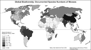
(Image Credit: Semantic Scholar)
Data was illustrated close together through the use of columns. The concept for improving the process used for data clustering was very similar to visually shading maps. The result of this discovery was a lot like the modern version of a heat map. During the early 1990s, the process was trademarked by Cormac Kinney, a software designer. He used a type of heat map for the illustration of financial data. As time passed, technology substantially improved leading to an exceptional expansion of the internet.
Heat maps were then appropriate for illustrating an incredibly wide variety of data. The history of heat maps is important to help you understand why and how heat maps are currently used and the reason for the popularity.
Understand your Google Analytics + test your SEO in 60 seconds!
Diib easily syncs with Google Analytics and then uses the power of big data to help you quickly and easily increase your traffic and rankings. We’ll even let you know if you already deserve to rank higher for certain keywords. As seen in Entrepreneur!
- Easy-to-use automated SEO tool
- Keyword and backlink monitoring + ideas
- Speed, security, + Core Vitals tracking
- Intelligently suggests ideas to improve SEO
- Over 500,000 global members
- Built-in benchmarking and competitor analysis
Used by over 500k companies and organizations:
Syncs with 

You Might Also Like
What are Web Heat Maps?
You can use a web heat map for displaying the sections of your web pages most often scanned by your users. If you have ever used an analytics tool such as Google to analyze your website, you already know this type of knowledge is incredibly useful. No, heat is not the basis of your heat map. The name was derived because heat maps are a visual representation of the activity or heat within the human body.
Think of your heat map as a CT scan for the pages on your website. Instead of using heat radiating from the human body, algorithms are used to make a very intelligent estimation regarding where your users crawled your site and where they tend to linger. You can use this information for the creation of additional content your users will both appreciate and love. The idea is to increase both the popularity of your website and your conversions by determining exactly what your visitors are looking for.
Downloading Heat Map for Google Analytics
Google offers you the ability to use this tool with Page Analytics. This is available as a Google Chrome add-on. You will not be able to install the required add-on unless you have already installed Google Chrome. Accessing your heat map is easy because it is available in your Page Analytics. To make finding it even easier, you can bookmark your add-on to the top of Chrome. This ensures you will be able to see any changes taking place in your heat map. You can download everything you need with the following steps.
Step One
Make certain Chrome is installed.
Step Two
Download the Google add-on titled Page Analytics.
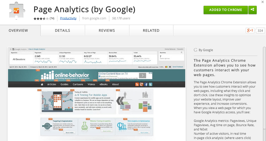
(Image Credit: Smart Insights)
Step Three
Bookmark your add-on for easier access to your heat maps. It will then appear here:
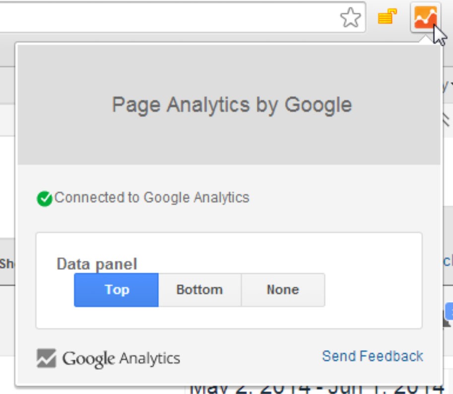
(Image Credit: Google Support)
You can use heat map visuals at any time to improve your website. Although the Page Analytics heat map is not quite as in-depth regarding statistics and information as some of the dedicated tools available, it is still an extremely effective tool. You also need to consider dedicated tools can be expensive and you may already have Google Analytics. The program is often included in suites including the majority of what you will need for your website. Before purchasing something al la carte, you should try the heat map for Google Analytics.
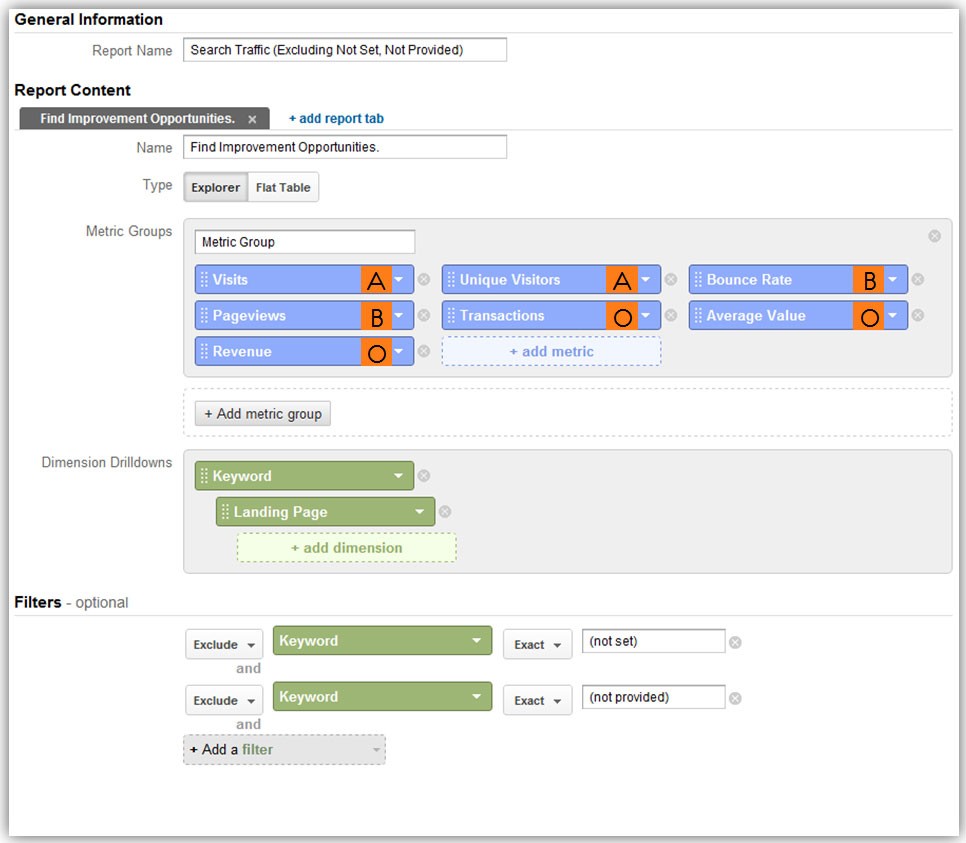
Creating a Custom Report
To help ensure you receive optimal benefits from your heat map, you should consider creating a customized report for your specific requirements. Here’s how:
- Begin by navigating to your custom menu located on the right side of your screen.
- Click on customization, then on the new report.
- Now enter a title for your report like a customized heat map.
- You can now enter the metrics you are interested in measuring.
- Go to the dimensions section to add week names, days and hours.
If you want to watch your results more closely, there is an option for adding a specific section for your data. Once you have completed everything, you are able to view your report. You can choose your date range from the top right side of your screen. From this area, you can choose the time range you want your heat map focusing on. If you do not have a lot of data, the recommendation is choosing a date range offering you a large quantity of data.
Your next step is exporting all of your data to Excel. You can now insert your pivot table. Use the columns for placing the days of the week, rows for placing hours of the day and the value section to place what you want to check such as transactions or sessions. Go to the value section to select your color of choice for your heat map. The colors will quickly show you the best and worst times according to the shades. If you decide to change your metrics, click on your table.
You can now unselect the metrics you chose, select new metrics and reapply your heat map. You can take advantage of more in-depth insights by using total columns and rows. You can also obtain additional comprehensive data like your conversion rate by dividing two different metrics with the calculator. You will achieve the best results when you have a lot of data. A good example is a higher percentage of session duration and page views are more beneficial when using your heat map. Your heat map is unreliable if you are using small data.
Information Available with Website Heatmap Google Analytics
There are two different ways to read your heat map with Google Analytics. You can review your raw data points or view your visualization. You can find issues and click trends quickly because your heat map is coded. The greatest interaction is displayed in red with the least in blue. The following information can be gained by viewing your heat map.
- Rarely clicked icons that do not appear clickable
- Determining when your users visit so you know when to publish
- Tabs and links below the fold that are not being clicked
- Data for building PC strategies
- Not useful general information your visitors are ignoring
- Determining the best areas for sign-up forms and CTAs
- Information your visitors are scrolling over
- Finding the best times for the organic promotion of your products or content
Once you start checking your Google Analytics heat map regularly, you can improve your SEO auditing and analytics tools. You will receive invaluable information for optimizing your website. You need more than just links and keywords for effective optimization. Using the right tools is important to help ensure you have logically laid out your website. You want your website to be aesthetically pleasing to help make certain your visitors are aware of what is and is not important.
Make certain everything meant to be interactive or clickable on your site looks that way. Your design should have a visually intuitive look and feel to drive your visitors to specific pages or links. You can use the Google Page Analytics heat map to ensure all necessary aspects are in place.
Types of Google Analytics Heatmaps
Scroll Maps
The exact percentage of your visitors scroll activity is described by scroll maps. The redder the shading, the more visitors have viewed that section of your page.
Move Maps
Move maps provide a representation of where your visitors are spending the majority of their time while navigating with a mouse. It measures where your visitors are pausing their mouse and moving on your page. The red spots show where the mouse movement of your visitors has been paused. According to research, there is a direct connection between mouse position and where consumers are looking while navigating pages.
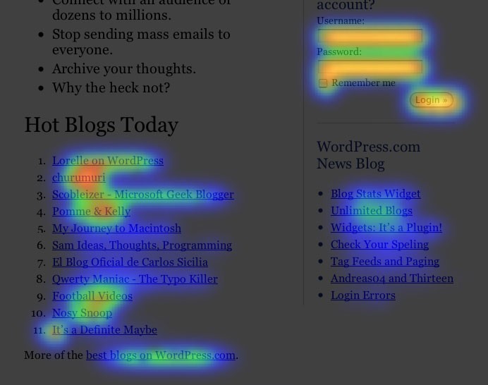
Click Pages
Click pages are exactly how they sound. You will see where your visitors have clicked using their desktop devices. Heat maps are referred to as touch heatmaps for users with touch-support or mobile devices. The color-coding of your map shows the page elements that have been clicked on the most. The highest number of clicks are shown in red. You can determine the number of clicks and which buttons are the most popular. Even if your visitors click on a non-clickable button, it will be recorded. For example:
(Image Credit: Moz)
Device Heatmaps
Device heatmaps reveal your performance in desktop computers vs mobile devices. This is a good opportunity to determine how your content should be outlined for different devices.
Benefits of Google Analytics Heat Maps
Heat maps enable you to understand the interactions of your visitors with your website. You can use heat maps to locate significant issues resulting in important content being disregarded by your users or distracting them from important elements. Heat maps offer a lot of benefits for your business including:
We hope that you found this article useful.
If you want to know more interesting about your site health, get personal recommendations and alerts, scan your website by Diib. It only takes 60 seconds.
Instant Overview of Issues with Web Performance
You can use your heat map to immediately determine which sections of your pages are not performing well. Each heat map has different attributes capable of showing you the most important issues. If you see a cold area, you know the section is not getting a lot of attention. You can re-evaluate your pages to eliminate or improve the areas your users are not interested in. You can determine the best locations for conversion by using Geo heatmaps to ensure you know where to focus.
Learning from User Activity
You can benefit from forms and surveys. One of the most important benefits is learning from user activity. Your heat map will display the navigational pattern of your visitors as evidence of unfiltered and direct feedback. Design decisions for the future can also be tested without the need to deploy them to a large audience.
Visualizing Numeric Values
Just one heat map can provide you with a lot of important information. The numbers on spreadsheets provide you with detailed information including the pages with a high bounce rate and CTR or click-through rate. The difference with heat maps is you can see where the problems are. This is a good option to determine many of the causes of your website issues.
Understanding the Interests and Frustrations of Users
You can use the friction scores you receive from your heat map for tracking data points to determine why your visitors become frustrated and exactly what they enjoy.
Diib®: Learn to Read Your Google Analytics Heat Map!
Whether you are a veteran Google Analytics user or you just started out, Diib can help. Our User Dashboard seamlessly integrates with your Google Analytics account and heat map. Here are some of the features of that dashboard we’re sure you’ll appreciate:
- Bounce rate monitoring and repair
- Google Analytics Integration
- Broken pages where you have backlinks (404 checker)
- Keyword, backlink, and indexing monitoring and tracking tools
- User experience and mobile speed optimization
- Technical SEO monitoring, including your GA mobile app
Click here for your free scan or simply call 800-303-3510 to speak to one of our growth experts.
FAQ’s
Not exactly, however, with the help of a Google Chrome extension called Page Analytics, the data from Google Analytics can be mapped in a heat map.
Heatmaps can show user behavior on specific webpages or templates. It shows data like: conversion rate, average session duration, bounce rate and page views.
You can create a sitemap manually with Excel by coloring each cell depending on its value. Or you can enter a smart formula/function to do the work for you.
This is a heat map using colored cells to show a 2D correlation matrix between to discrete dimensions or even types. These are used for comparing the measurement for each pair of dimension values.


One thought on “What is a Google Analytics Heat Map and How to Read One!”